The Daemonites have released a brand new, native theme for the Discourse forum based on the Google Material design guidelines.
As Flash as a Rat with a Gold Tooth
There’s a lot of effort in Materializing a design that didn’t start out that way. We’re happy with the result.
Topic Preview Plugin Support
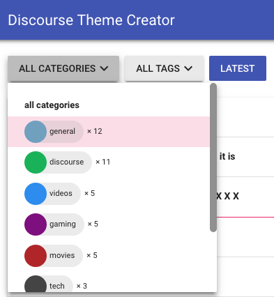
Colourful Sub-Categories
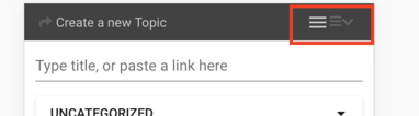
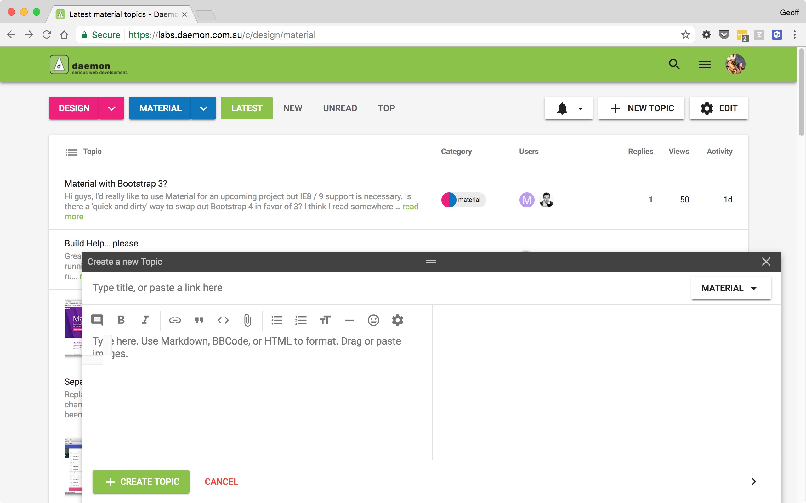
New Topic; with Inbox inspiration
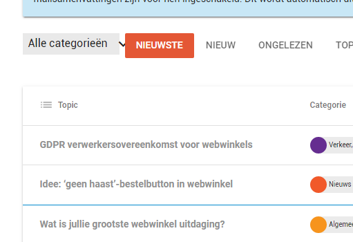
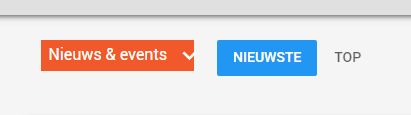
Menus, Buttons and Material Icons
Why build “another” Material based theme?
Yep. There’s already a really cool Material Stock theme for Discourse available. It’s a bit different in places, and even includes a DARK mode.
Our forum has been running it’s own Material theme for some time. We’ve finally wrapped this up into the new Discourse Theme format for distribution. Plus as we use the theme as the foundation for some other Discourse related projects we need something within our immediate control.
Overall i think the only way we can describe the visual differences is that ours is more Material; covers more elements in the style guide, more accurately. That said, whether you like one or the other will probably boil down to personal preference – we make a few opinionated choices with respect to certain elements.
For reference, the theme is similar in approach to the Daemonite Material for Bootstrap 4 project:
While Discourse is not Bootstrap-based, we do adhere to the same Material principals advocated in that design project.
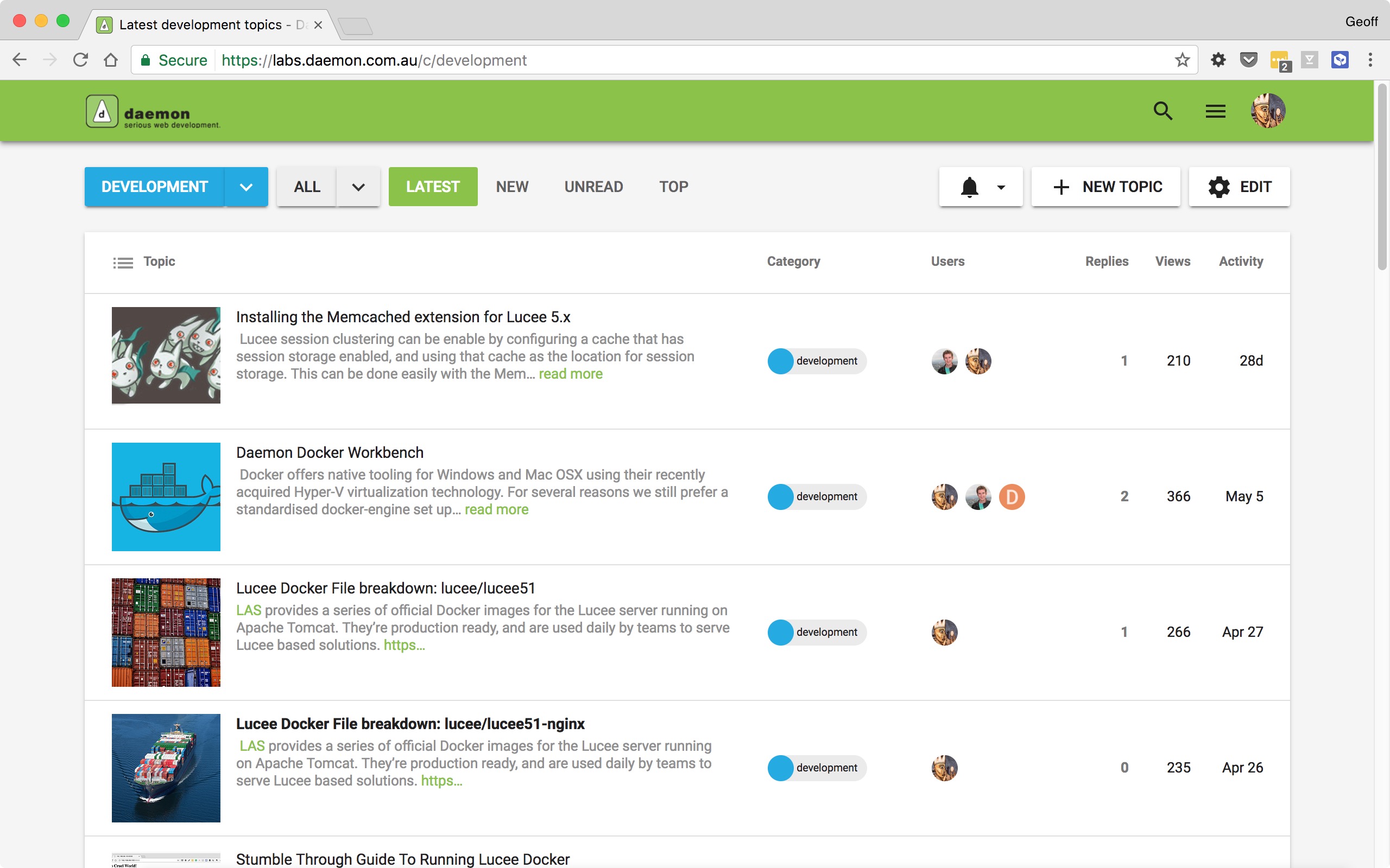
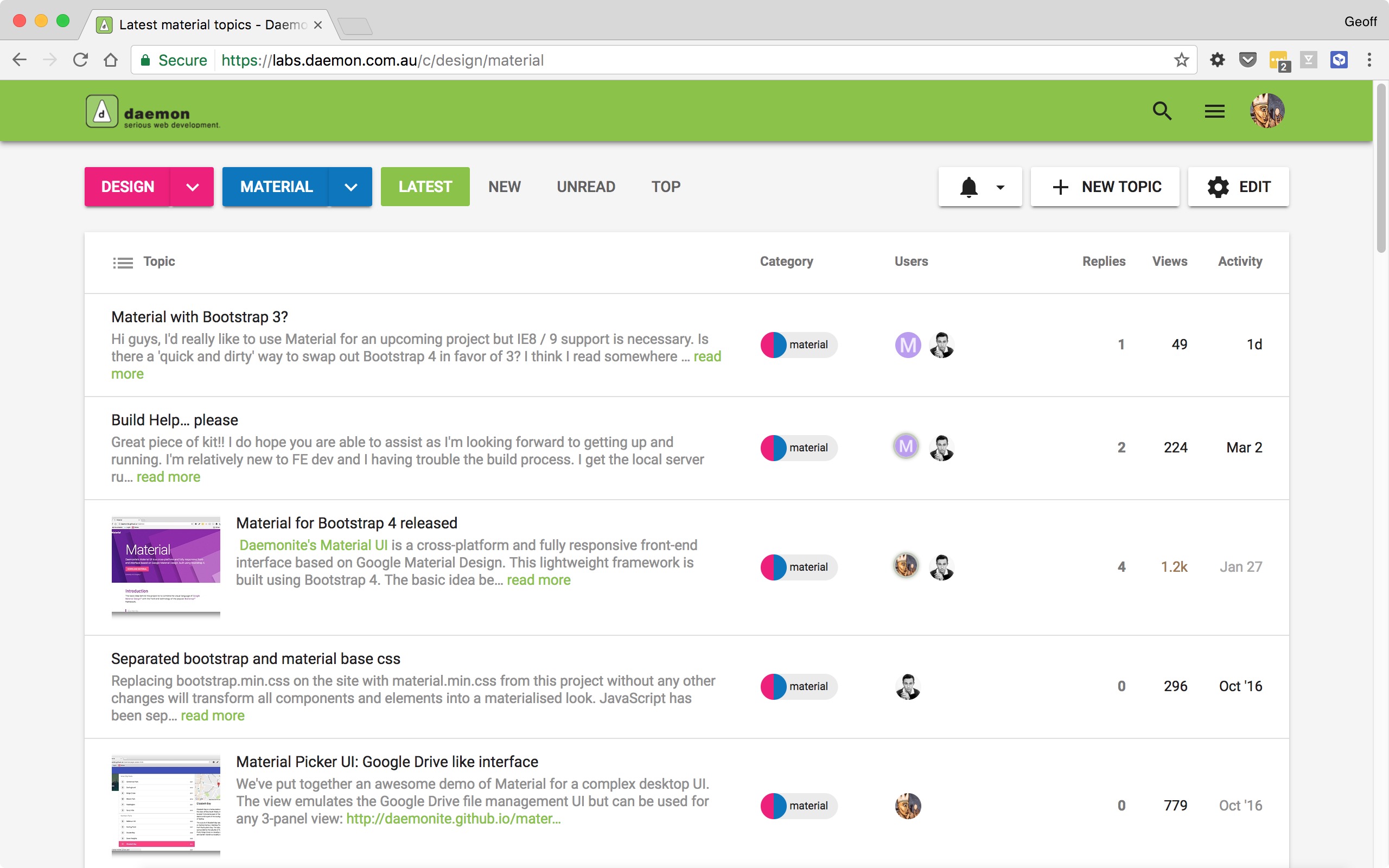
You can see the theme running live at our Labs forum:
The new Material theme also works well with another theme we released earlier: the discourse-clipboard theme which adds a COPY TO CLIPBOARD feature for code blocks.
I’ve tried this theme with Firefox 54.0.
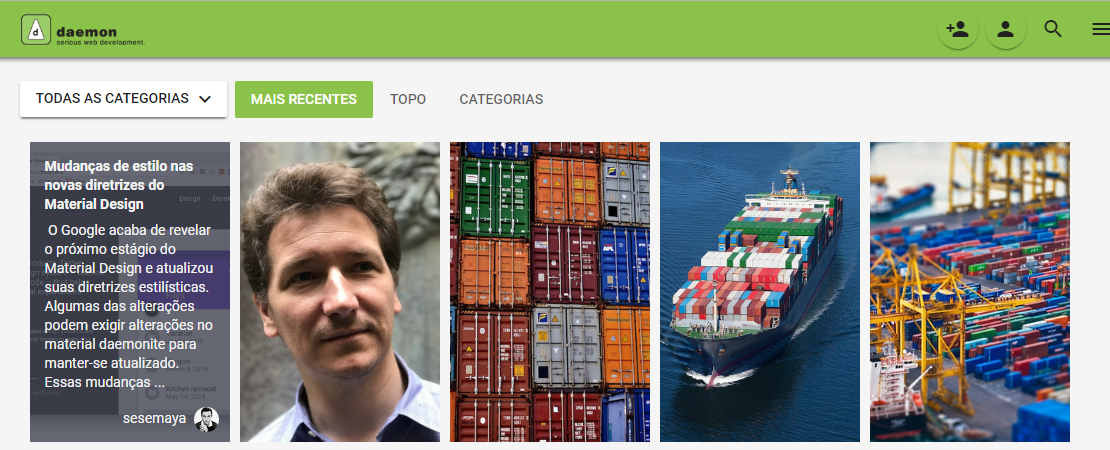
This is how it looks:
I think the problem is the height: 32px you set for .badge-wrapper.box span.badge-category-bg, .badge-wrapper.bullet span.badge-category-bg.
Removing the height should fix the problem.
Thanks for pointing out the including assets feature, I’m just a bit afraid that we will need to manually track when new icons have been added to Material Icons or Roboto has been updated and then update the theme accordingly if we go for this option. Although neither are updated frequently, using Google Fonts just seems to have one fewer thing to worry about.
I had a look of this in Firefox. In fact, if you make any changes that has something to do with the box model (height, margin, width, etc.) in the Inspector, it seems to fix the problem.
Since badges are now display: inline-flex;, maybe we don’t need to absolute position badge-category-bg or badge-category-parent-bg anymore.
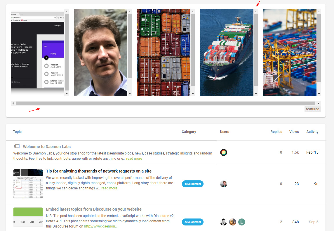
Apologies if this is a ridiculous question, but I really cannot figure out how to get the images showing on the front page when using this theme. As in, on the first screenshot shown, every topic has an image associated with it. I’m trying to make this happen on my install of Discourse and testing by creating posts with images - but no image comes through to the front page.
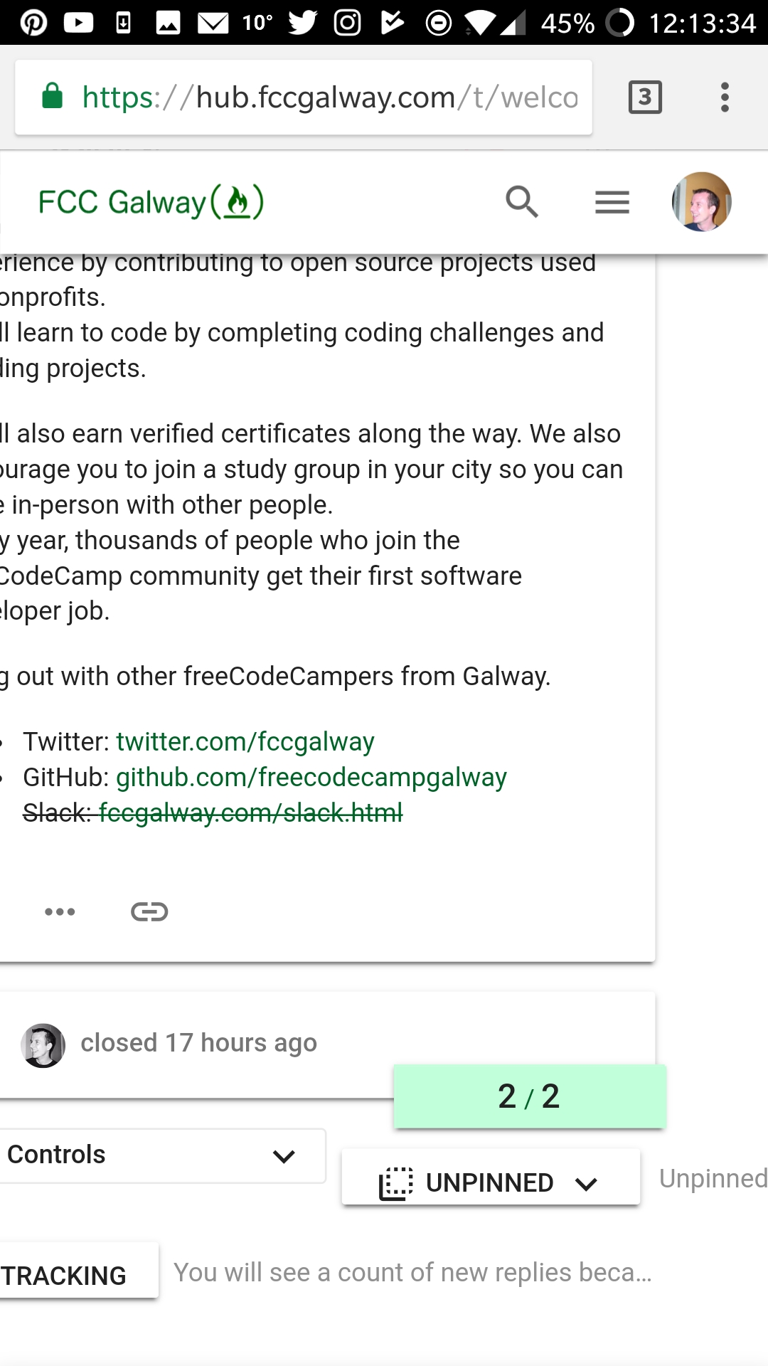
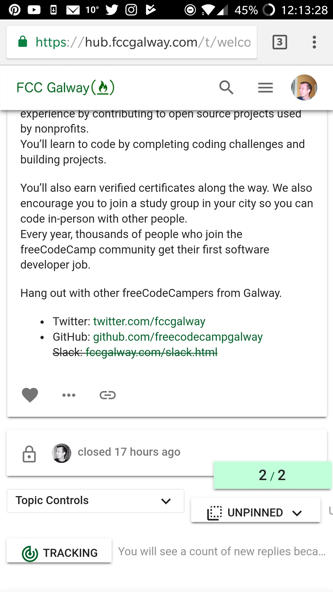
Hi, I am seeing issues on mobile where some buttons and text not reaponivw. See the “Unpinned” button and adjacent text causing horizontal scrolling and messing with the responsiveness.
@modius , @sesemaya I am running the Material Design Stock Theme, I like the layout of that theme, but like elements of your theme as well, especially the log in and sign up buttons, and category “pill” buttons. Is there a way to add those in to my current theme?
I tried via css with variations on &.sign-up-button { @include material-icons(‘person_add’);
but that didn’t work. Any ideas?
So, the category buttons, and making login and signup buttons font awesome…
The biggest thing I want to keep is the + button for new topics on the bottom right.
Funnily enough we removed the + on account of it being awkward to get it “right” in all the places it would sit. And while it works in a mobile view it looks a little odd in the desktop view; or at least it takes a bit of getting used to.
@sesemaya what’s the chances of getting a + back as an optional child theme? Is this something we could support?
Unfortunately there is not an easy way to import bits and pieces of a theme. You will have to cherry pick the styles for the components/features you like from the compiled CSS or Sass and apply theme on top of the theme you are currently using.
@sesemaya Thanks for merging! In the course of the modifications and other updates we seem to have ended up with two toggles in the mobile compose. I think it might be because you’ve added both .toggle-toolbar and fa-bars to the material icon :before overrides.
This is likely because I just merged FontAwesome 5 into master and now the core icons are no longer in :befores (more here). I tried removing the :before on the browser console, and it seems to do the trick.
@modius, at the moment it looks like using the old icon render works. Here’s the code if you want to try it out in the </head> section of a theme component:
<script type="text/discourse-plugin" version="0.8">
const h = require("virtual-dom").h;
// Support for font awesome icons
function faClasses(icon, params) {
let classNames = `fa fa-${icon.replacementId || icon.id} d-icon d-icon-${
icon.id
}`;
if (params) {
if (params.modifier) {
classNames += " fa-" + params.modifier;
}
if (params["class"]) {
classNames += " " + params["class"];
}
}
return classNames;
}
// default resolver is font awesome
api.registerIconRenderer({
name: "font-awesome",
string(icon, params) {
let tagName = params.tagName || "i";
let html = `<${tagName} class='${faClasses(icon, params)}'`;
if (params.title) {
html += ` title='${I18n.t(params.title).replace(/'/g, "'")}'`;
}
if (params.label) {
html += " aria-hidden='true'";
}
html += `></${tagName}>`;
if (params.label) {
html += `<span class='sr-only'>${params.label}</span>`;
}
return html;
},
node(icon, params) {
let tagName = params.tagName || "i";
const properties = {
className: faClasses(icon, params),
attributes: { "aria-hidden": true }
};
if (params.title) {
properties.attributes.title = params.title;
}
if (params.label) {
return h(tagName, properties, h("span.sr-only", I18n.t(params.label)));
} else {
return h(tagName, properties);
}
}
});
</script>
It looks like there still might be a few icons that aren’t rendering correctly (.fa-thumbtack is the notable one), but in any case, I think this might be one angle to look at.
Although there are still a few icons that are not rendering correctly, they are because of naming changes in FontAwesome 5. For example, .fa-thumbtack in 5 was .fa-thumb-tack in 4. I will go through the changes and update theme CSS accordingly.
first things first: Thank you so much for conceiving and maintaining this fantastic theme.
We would like to give it a ride in favor of the Material Design Theme and in order to do so, tried to install a fresh instance of Discourse (2.2.0.beta7) just yesterday. We imported your theme directly from its GitHub URL https://github.com/Daemonite/discourse-material-theme, thus using the current development head.
However, we found some layout/rendering glitches we would like to share with you:
1. Icons in category list slightly off
2. Icons inside chips slightly off
Topic list
Topic list hamburger menu
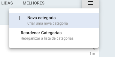
3. Checker marks for color selection slightly off inside “New Category” dialog
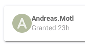
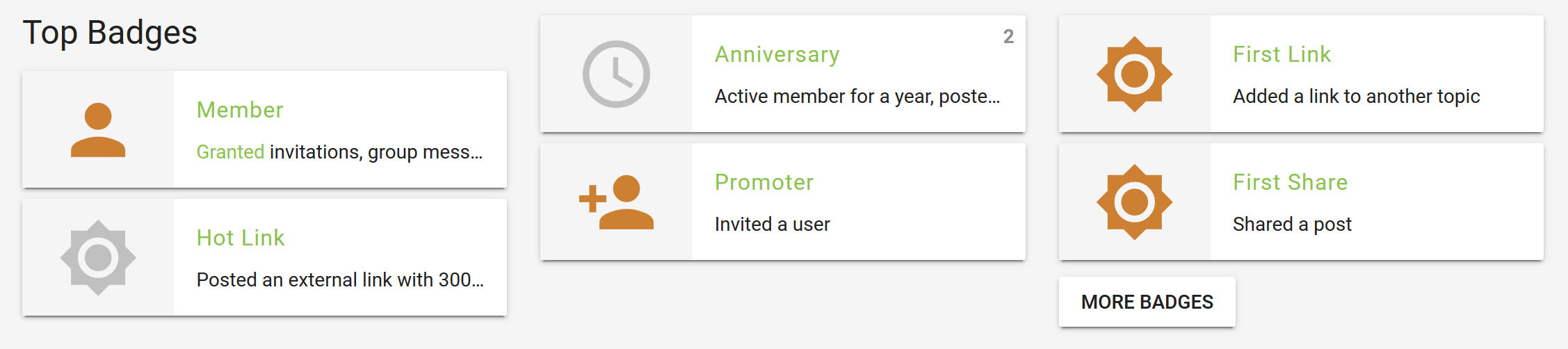
4. Padding between avatar icon and username too narrow on personal badge page
Both things can be mitigated by touching the .d-icon class at runtime. While .d-icon elements originally get sized at about 0.76em, increasing this by 1.0em like
Result
Will make things look more smooth again:
However, I wouldn’t know how to add this at “compile time”, i.e. to make it persistent. I just manipulated the CSS using Browser developer tools at runtime.
Nevertheless I wanted to share this insight with you, you might know way better which things to adjust appropriately.
You can usually override plugins and themes with your own CSS installed as a Theme Component. I do this all the time. Create a Theme Component, add the delta CSS and add the Component to the Theme.
Hi @amotl, all the above issues have been fixed in the latest version. Theme still has some other issues with beta7 and I’ll try to get them fixed. In the meantime, if you see any bugs, please feel free to post them here or in GitHub.
Hi @sesemaya, this works like a charm. Thank you so much!
Thanks, we’ve spotted one or two other minor things and will be happy to share them along with some adjustments we additionally made to tweak the theme further.
Thanks again for your quick response and keep up the spirit!
After putting everything together, the preliminary results can be viewed here:
Quote blueprint ;]
Discourse and its Daemonite Material theme are truly gems in their fields. Thank you so much for bringing them together as such an amazing tandem of carefully crafted software components.
We hope that our humble feedback can contribute to further maturing.

")
")
")
")
")


")
")
")
")
")
")
")
")
")
")
")
")
")
")
")
")