Sam's Simple Theme

82328 views 368 replies Created 2014-12-31 03:20

Although I have no particular plans, I think this is a lot like what I would want my topic lists to look like once I get around to really customizing them.

I would probably use a bit stronger colours myself, as in darker. I also second reply count number being a point bigger and suggest that you try to scale avatars just enough to fill the row vertically, or scale everything else down accordingly.

I’m wondering about the latest post - once i have scrolled this page down enough not to see the column headers, I somehow think that the avatars and nicknames are in fact starters’ 😄

edit: once I clicked the image to 100% zoom, I’d probably shrink the overall font size one point and cut down the padding/margins by a couple of pixels.

edit2: I really would like to eventually see this sort of minimal layout as a selectable alternative to the default layout. well good mate.

@sam: very cool stuff with the sticky parameter, thanks!

Another stupid question: where can I find the original templates? I was poking around if I can find the original list/topic_list_item (e.g.), but my grep skills failed miserably
 can you point me in the right direction? I wanted to make some more subtle adjustments, but for those, I need the original handlebar codes


I really like this @sam!

Also not a huge fan of the tag glyph — definitely in favor of the color bars we currently use on category pages

Also agree on separating the date from usernames
 dates could be a lighter grey, or the date can be separated by a comma or something simple

How sticky should this be? Looks like it works only till the end of the session.

An interesting observation regarding, “I have this issue in theory vs in practice”

I started using this design exclusively on meta, and just now fixed incorrect avatars for last posters.

Its one of those issues that in practice is critical, but in “theoretical” reviews is often missed.

I like the changes overall, and am trying it on my install to see how it goes.

It breaks the categories view as well as affects the suggested topics module.

Is this the issue where for some threads it shows the wrong avatar? Because I have that currently, but don’t see any updates to the code in the first post.

The suggested topics change is by-design, but the categories do look quite bad, will get that fixed.

Sorry, will sync the code up shortly.

edit updated now.

Thanks!

I see you’re setting up some stuff for likes columns?

One thing I noticed and which I had to fix to get working was this:

<script type='text/x-handlebars' name='components/topic-list-header.raw'>

which should be

<script type='text/x-handlebars' data-template-name='components/topic-list-header.raw'>

nope, not really, you need to be running latest for this to work, I just cut-and-paste this from our customization section.

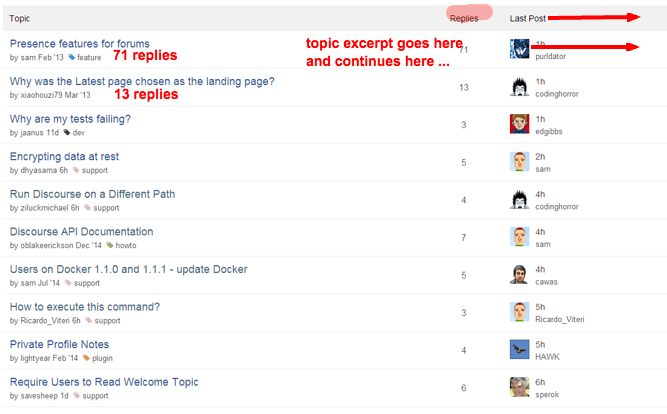
I love the direction this is headed. Very clean. At the risk of appearing more “social” - Have you considered adding optional topic excerpts and/or image thumbnails? A nice responsive design that takes advantage of screen width 


  • tuck reply count under the title
  • push the avatars all the way right to eliminate the ragged right hand border
  • right justify the last poster and time immediately to the left of the avatar to open space in the middle
  • put the topic excerpt in the middle space only when the screen is “wide enough”
  • truncate the title as needed

[quote=“mcwumbly, post:58, topic:23552”]
@sam, for your consideration:

[/quote]I love that colored bar. I hope it gets adopted.

Another minimal topic list design i’m impressed with:

A lot of custom CSS and some js.

The author: Pieter Levels

I really like what’s going on here!

I back this up as well!

The color bars from @mcwumbly work well, but not if there are lots of subcategories, since color for subcategory alone (or parent category alone) is of little semantic meaning, increasingly so as the number of subcategories increase. If there were two side-by-side color bars for the parent-child combo, then the issue would be resolved & semantic meaning preserved. 🙂

Focusing on the category display:

For forums that have a flat category structure, and distinct category colors, this might be fine. I have a few reservations about this, however:

  1. It’s slightly more difficult for new users to learn the structure of the forum. While not a huge concern, it is something to consider.
  2. On forums with category trees (sub-categories), the colored bar won’t be able to display the color structure. For some, this is preferred information. For others, it’s just noise anyway.
  3. How does this work with a pinned topic? Since pinned topics display a chunk of the OP beneath the title, how will this work in that scenario?

Otherwise, taking into account other changes that are in the pipeline, I think it’s pretty good. The one thing that might be worth considering is including the OP’s avatar next to their user name, but that might make that area too busy. As I said, worth considering.

I really like what they’ve done here.

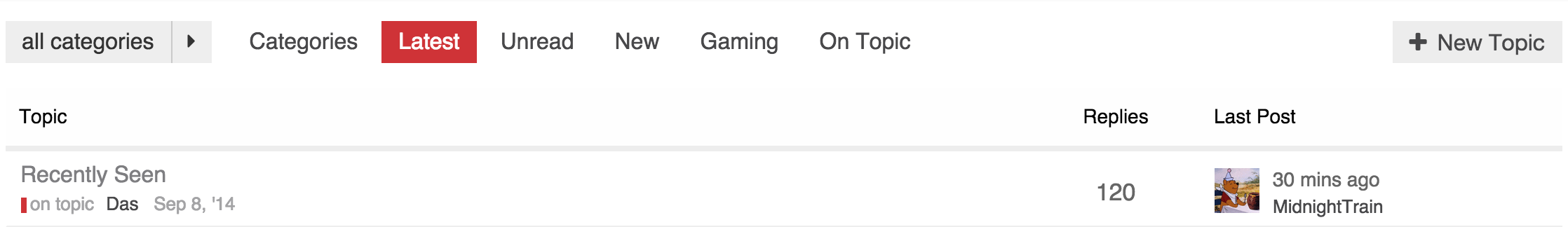
One of the small touches here that I think really helps make it feel cleaner is the lack of the header. It makes it feel much less like a stodgy old table.

The category styling is bold but not distracting.

And the two avatars to show the original and last poster keeps some good info. Having it on the left makes the page feel more balanced, without something too ‘heavy’ drawing the eyes away past the list of topic titles. Leaving enough margin to read through the list of topics.

The more I look at it, the more I like it.

Also, no tiger stripes. That’s one thing all these minimal designs have in common.

Now that stars are gone, what’s the one thing you would remove?

I think there’s a strong case for removing tiger stripes from the default design.

I have made my own changes to the new look for my site, have more I wish to do but here is what it looks like:

Figured I could share my variation for those that are curious.

Changes

  • Remove colspan attribute from main topic link td since it isn’t necessary
  • Clean up CSS to be more concise and use more SCSS capabilities
  • Hide topic list header
  • Make show more update bar smaller
  • Update to latest changes from @sam (though he is missing his latest changes here)
  • Styles no longer mess with category table, still need to clean that up to be simpler as well

CSS

Note: You should update $primary and $tertiary to match what you have in your colors config under the same names

$primary: #48484a;
$tertiary: #CF3337;

.show-more {
    top: -29px;

    .alert {
        padding: 5px 35px 5px 14px;
    }
}

.topic-list:not(.categories) {
  margin: 26px 0 10px;

  thead {
    display: none;
  }

  > tbody > tr:nth-child(odd) {
    background-color: white;
  }

  > tbody td {
    border-bottom: 1px solid #eee;
  }

  a.title:not(.badge-notification) {
    color: $primary;
    font-weight: normal;
    font-size: 16px;
    
    &:visited {
        color: scale-color($primary, $lightness: 30%);
    }
    
    &:hover {
        text-decoration: underline;
    }
  }

  .creator, .editor {
    font-size: 13px;
    display: block;
    margin-top: 3px;
    
    a {
        color: $primary;
    }
  }

  .main-link {
    width: auto;
  }

  td, .creator a, .editor a, .badge-wrapper a.badge-category {
    color: scale-color($primary, $lightness: 50%);
  }

  td {
    padding-bottom: 5px;
    
    &:first-of-type {
        padding-left: 10px;
        padding-top: 5px;
    }
  }

  .fa-tag {
    opacity: 0.7;
    font-size: 10px;
    margin-right: -2px;
  }
  
  .num.replies {
    font-size: 17px;
    color: #666;
    min-width: 75px;
  }

  .last-post {
    min-width: 130px;
    
    .relative-date {
      color: #666;
    }
  }
}


.last-post {
    .poster-avatar {
        margin-right: 10px;
    }
    .poster-avatar, .poster-info {
        float: left;
    }
}

.creator .badge-wrapper {
    .badge-category-parent {
        margin: 0;
        padding: 0px 1px;
    }

    .badge-category {
        padding: 0 0 0 3px;
        margin-right: 5px;
        font-size: 13px;
        font-weight: normal;
    }
}

Header

<script type='text/x-handlebars' data-template-name='list/topic_list_item.raw'>

  <td class='main-link clearfix'>
    {{raw "topic-status" topic=topic}}
    {{topic-link topic}}

    {{#if controller.showTopicPostBadges}}
      {{raw "topic-post-badges" unread=topic.unread newPosts=topic.displayNewPosts unseen=topic.unseen url=topic.lastUnreadUrl}}
    {{/if}}

    {{raw "list/topic-excerpt" topic=model}}

    <div class='creator'>
        {{#if showCategory}}
            {{category-link topic.category showParent="true" onlyStripe="true"}}
        {{/if}}

        {{~#if topic.creator ~}}
            <a href="/users/{{topic.creator.username}}" data-auto-route="true" data-user-card="{{topic.creator.username}}">{{topic.creator.username}}</a>
            &nbsp;
            {{format-date topic.createdAt format="medium-with-ago"}}
        {{~/if ~}}
        
        {{raw "list/action-list" topic=topic postNumbers=topic.bookmarked_post_numbers className="bookmarks" icon="bookmark"}}
        {{raw "list/action-list" topic=topic postNumbers=topic.liked_post_numbers className="likes" icon="heart"}}
    </div>
  </td>


  {{#if controller.showLikes}}
    <td class="num likes">
      {{number topic.like_count}} <i class='fa fa-heart'></i>
    </td>
  {{/if}}

  {{#if controller.showOpLikes}}
    <td class="num likes">
      {{number topic.op_like_count}} <i class='fa fa-heart'></i>
    </td>
  {{/if}}

  <td class="num replies">
    {{topic.replyCount}}
  </td>

  <td class="last-post">
    <div class='poster-avatar'>
      <a href="{{topic.lastPostUr}}" data-user-card="{{topic.last_poster_username}}">{{avatar topic.lastPoster usernamePath="username" imageSize="medium"}}</a>
    </div>

    <div class='poster-info'>
      <a href="{{topic.lastPostUrl}}">
        {{format-date topic.bumpedAt format="medium-with-ago"}}
      </a>
      <span class='editor'><a href="/users/{{topic.last_poster_username}}" data-auto-route="true" data-user-card="{{topic.last_poster_username}}">{{topic.last_poster_username}}</a></span>
    </div>
  </td>
</script>

<script type='text/x-handlebars' data-template-name='topic-list-header.raw'>
  {{raw "topic-list-header-column" order='posts' name='topic.title'}}

  {{#if showLikes}}
    {{raw "topic-list-header-column" sortable='true' order='likes' number='true' forceName='Likes'}}
  {{/if}}

  {{#if showOpLikes}}
    {{raw "topic-list-header-column" sortable='true' order='op_likes' number='true' forceName='Likes'}}
  {{/if}}

  {{raw "topic-list-header-column" sortable='true' number='true' order='views' forceName='Replies'}}
  {{raw "topic-list-header-column" sortable='true' order='activity' forceName='Last Post'}}
</script>

<script>
  Discourse.TopicListItemView.reopen({
    showCategory: function(){
      return !this.get('controller.hideCategory') &&
        this.get('topic.creator') &&
        this.get('topic.category.name') !== 'uncategorized';
    }.property()
  });

  Discourse.Topic.reopen({
    creator: function(){
      var poster = this.get('posters.firstObject');
      if(poster){
        return poster.user;
      }
    }.property(),
    lastPoster: function() {
      var poster = this.get('posters.lastObject');
      if(poster){
        if (this.last_poster_username === poster.user.username){
          return poster.user;
        } else {
          return this.get('creator');
        }
      }
    }.property('posters'),
    replyCount: function(){
      return this.get('posts_count') - 1;
    }.property(),
    hasReplies: function(){
      return this.get('posts_count') > 1;
    }.property()

  });
</script>

Enjoyed reading through this topic and liking the minimal designs by @sam and @chapel

Do visitors really care about the categories, author, date? It seems the only time it’s relevant is when someone is reading and have interest in the topic otherwise can’t see why it can’t look like the current ‘suggested topics’ layout with just the topic title.

This is really good. Following on from @mcwumbly’s comment (also very insightful, I realized while reading it that putting avatars on the left in the topic list gives a “talk bubble” effect to the title that I had not considered
 also symmetric with posts too) I think you could suppress the header as well!

Hopefully we can ship one or more of these topic list layouts as choices out of the box at some later date
 part of the mythical setup wizard.

A bit more tweaking

The main difference at this point is the topic title font size and the td height which I have compressed more. Mainly because I wanted to optimized information density due to one of my staffs complaint about seeing less topics per “page”.

@sam any progress on the category page? Thinking of tackling it tonight when I get home.

Sure, feel free to tackle it! not sure what to do here, the funny thing about the category page is that I never use it so its kind of low priority for me.

I actually don’t like it (as far as using it). I prefer latest tbh.

My community which is used to older forum software asked for the category view be the homepage, and ultimately it was such a small change. So I see the category view more than I would if I had it setup exactly how I would personally like it.

Looks like there is potentially a bug in the server code in regards to who is the original poster when the original post is edited.

Interestingly enough, the edit history only shows @codinghorror editing the post once, and it was the first edit. I checked, and it isn’t an issue with ordering, as the first user in the array returned is @codinghorror and he is listed as the original poster.

This is not a bug, its by-somewhat-hard-to-explain-design

@codinghorror split off the topic from another topic so he is considered the “creator” of the topic, despite post #1 being mine.

I do agree its confusing and kind of wish we had a way to override this.

edit

Actually there is a workaround, admin wrench, select first post, change ownership to sam.

I see, well in a way that makes sense.

I just prefer it for consistency. It’s good to have something static. My users and I are all new to Discourse and loving it, but somehow it feels good to have a routine. A safe place to get started.

Sometimes I feel that there was something I was supposed to make a topic of, and then when I see the categories they remind me. I like the little things in life.

damn straight.

Maybe double the size of those category bars? Lighter colors seem to disappear to the background.

Actually that makes perfect sense, but I if something can be made configurable, it should.

In an ideal situation the first person to derail will split the topic BEFORE the second person, and even in the case of the second person to derail splitting the topic it’s still not a lost cause, and if it’s absolutely necessary to change ownership of a topic, it’s not biggie when having enough moderators around.

edit: man I love quoting in discourse.

That is actually my intention, will live with it for a bit and see how I feel.

On my variation I use the standard category helper which by default has a fatter color bar as you can see in my screenshot. I am not 100% sold on the fat one, but the thin one is also not right either. Between the two though, I prefer the fat one, if only to be consistent with its usage elsewhere on the site.

I suggest you try it with different shades of (lighter, as you prefer :)) gray, it could work?

This should definitely be the new default design. The other one can be shipped as optional - code named “clown barf” or similar
 😉

Sam - Just wanted to congratulate you on this effort. Its very hard to make things simple - but this is much needed. I’ve been working with a developer on the same issue - so this is a welcome development.

"As the late Steve Jobs once explained, “When you start looking at a problem and it seems really simple, you don’t really understand the complexity of the problem. And your solutions are way too oversimplified. Then you get into the problem, and you see it’s really complicated. And you come up with all these convoluted solutions
.That’s where most people stop.” Not Apple. It keeps on plugging away. “The really great person will keep on going,” said Jobs, “and find
the key underlying principle of the problem and come up with a beautiful, elegant solution that works.”

No - I don’t use it either. I think its probably rarely used in general.

I know I must sound like a broken record, but please please please let’s not mess up and provide way too low color contrast in any new UI’s. (I realize category colors can be chosen but things disappearing into the background does not make an accessible UI.) Those with less-than-perfect vision (and W3C standards adherents) thank you all. 😛

Keep in mind, this is my design which is very focused around me for now. If we ship a second theme (which I think we will some time next year) we will make sure to account for that or at least add a “high contrast switch”

The table header style is starting to get on my nerves, too much grey there, is there a better style you can think of?

I was thinking that as well. It stands out too much against the list.

I like the subdued look of the default header, I wonder if we changed it to be more like the default table header.

Something like this?

I like that better, but I wonder if its necessary to have it at all?

To a certain degree I agree with you. I just wonder though if for people less accustomed to forum software would be confused as far as what the last two columns are.

We could get away with having replies be 120 replies for instance.

Keep in mind that it is there for more than as a visual heading, you can click them to resort the list of topics.

Also you would lose the sorting ability which can be handy

Questionable in a 3 column view which already defaults to sorting by 1 of those 3 columns


You could put the reply glyph next to the reply number, I guess. But to me the number’s meaning is obvious.

Hmm, will have to try it out to see how it feels tbh.

Workflow wise, are you aware we “live refresh” css as you muck with it.

I open up one window on customization and keep the editor maximised (there is a maximise button top right)

And another window with the site. It makes mucking with CSS a breeze.

Yep, figured that out working with customizations.

I really this design. I think that overwrite ember template is better then use javascript to move things around

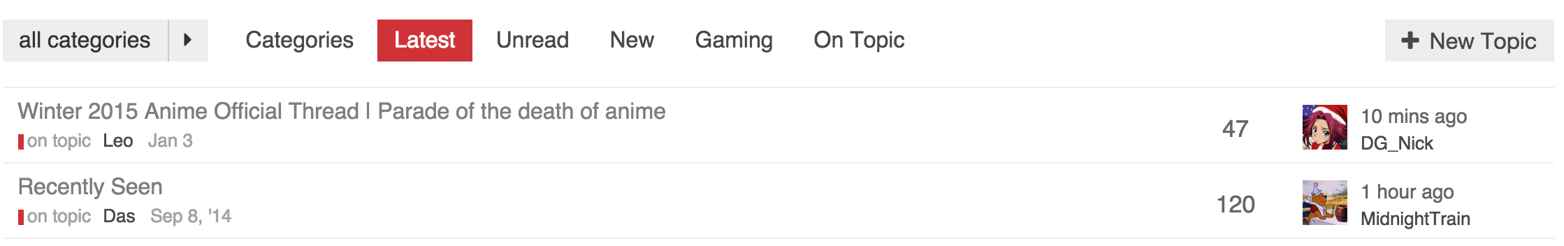
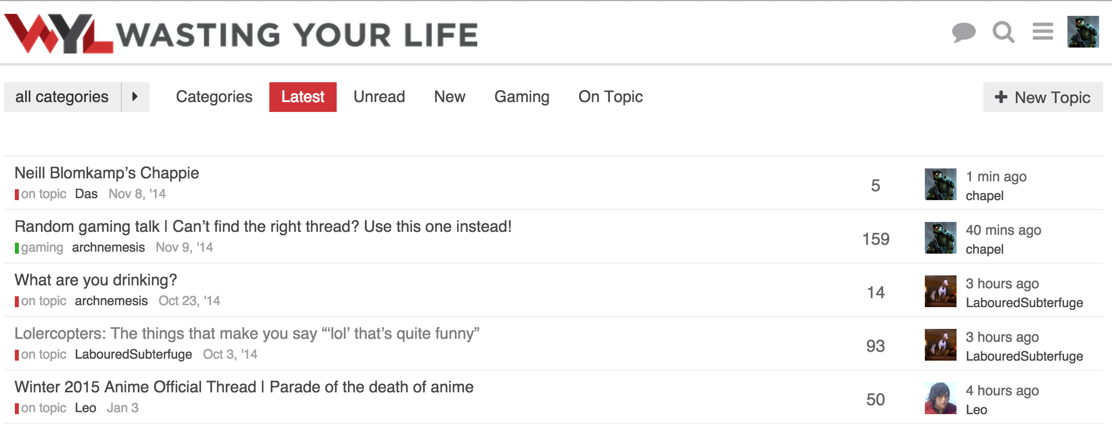
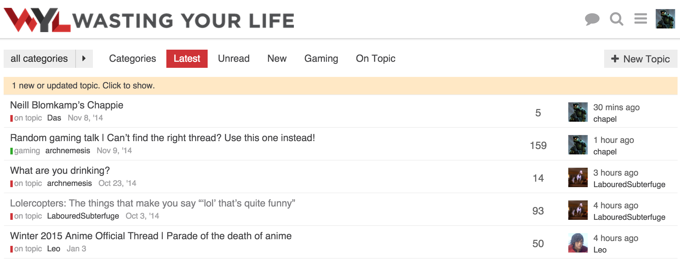
This is what I am running now. I have moved the thread list down to accommodate the update alert.

No alert

Alert

This allows the update alert to pop in without shifting anything down.

Functionality wise, I am fine without the table header, but visually it feels like something is missing. That could be just myself being used to tables on forums and how they normally look.
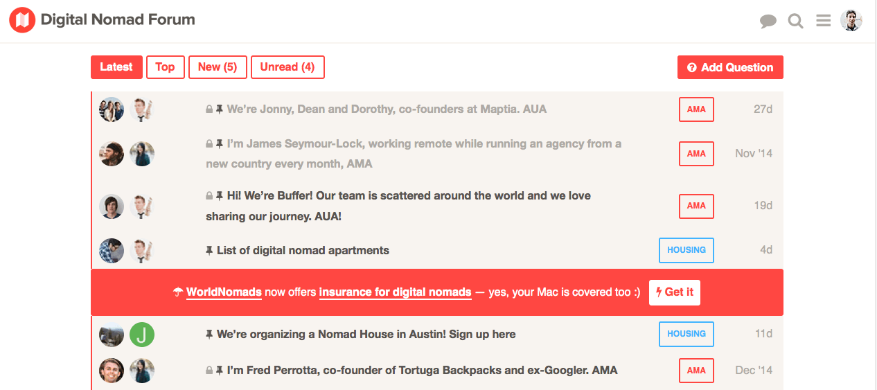
It would be great that at some point, as admin, you can choose one of those different topic list designs out of some menu.

Or maybe even better, let the users choose, in some setting, how they want the topic list to look.

Btw what CSS do you use for your latest design @chapel ?