This theme utilizes a full-width theme component made by @awesomerobot This theme includes the component for full-width as well as the dark/light theme toggle.
Hosted by us? Themes are available to use on our Standard, Business, and Enterprise plans.
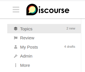
so no hamburger icon or collapsing sidebar? when i have the sidebar collapsed before switching to this one, how do i get it without having to switch back to get the hamburger icon? unless i am missing something obvious in the UI?
At phone size screens there isn’t bigger change how it looks compared to other ”basic” ones so basically this changes things a bit at tablet level — because there is no functional hamburger icon. It may work and look differently at bigger laptops and desktops.
But I really like how the sidebar looks with that, fonts are nice.
So could I suggest you make a component that gives same look to other themes? That would be really nice
Will there be a dedicated topic for the full-width theme component? I see some glitches, but they are related to the component, so I wonder if it makes sense to post here? There will likely be more full-width themes coming that use the component.
It seems like the full width setup is changing the header layout? I tried using the Header Search component, but it doesn’t show with the theme.
edit: ok, that’s weird. The component didn’t show on my instance where it was already installed and I added the theme. But when I install it after the theme, it shows.
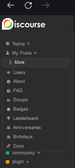
Also, the sidebar scrolls up along with the composer. Well, it also does that on the default layout. But it looks a bit strange when the sidebar is not above the composer, but left of it:
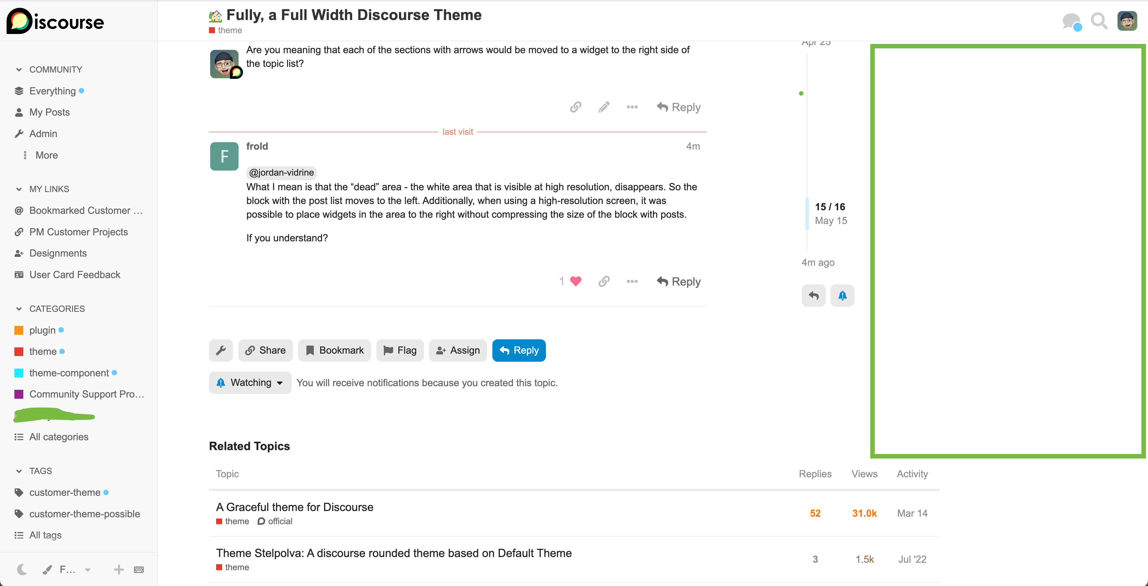
@jordan-vidrine
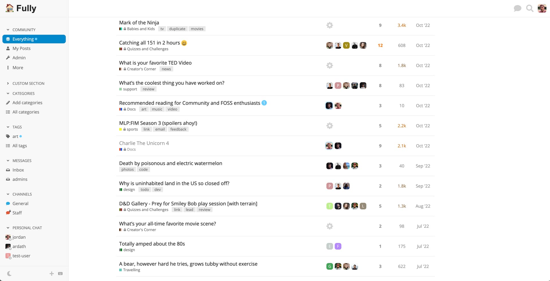
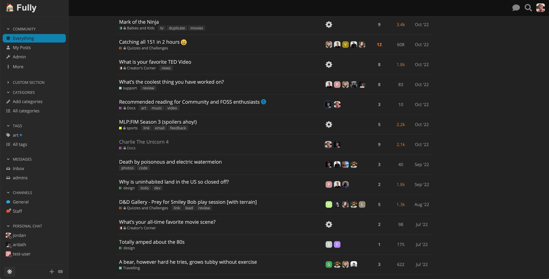
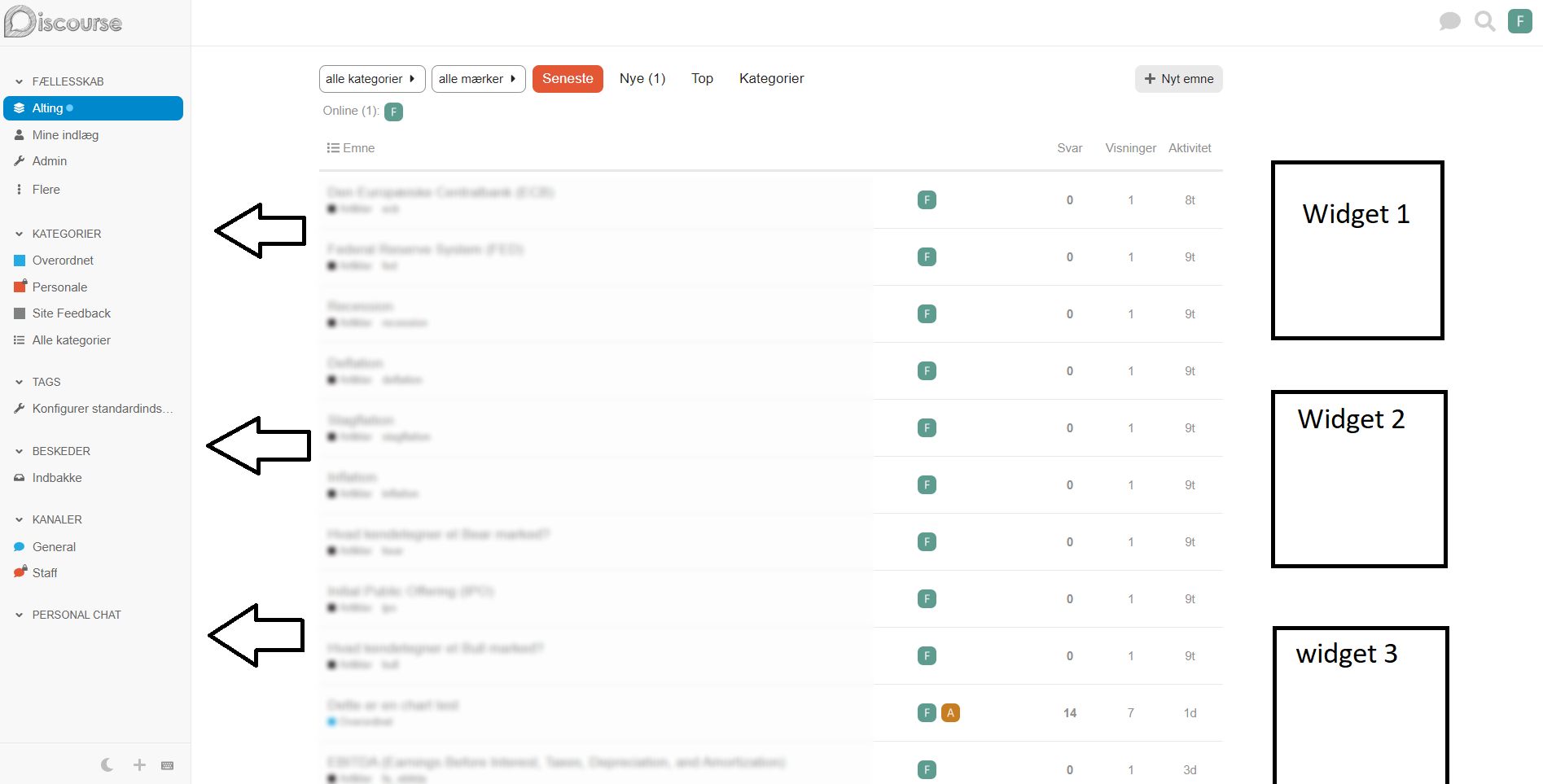
What I mean is that the “dead” area - the white area that is visible at high resolution, disappears. So the block with the post list moves to the left. Additionally, when using a high-resolution screen, it was possible to place widgets in the area to the right without compressing the size of the block with posts.
This theme currently could possibly handle some widgets on the right hand side. With some tweaking you could also customize some of the CSS here to change widths if you want.
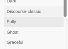
After using Fully for a couple of weeks (and loving it ), here are two things that popped up:
1. Chat indicator (online/green) isn’t visible when a row is selected
2. Is it possible to add the option to Show/Hide navigation menu?
I’ve often wanted to collapse the navigation menu to be able to focus on the main body of content in a topic, and also if I’m splitting screens vertically to find more screen space. This is more of a nice-to-have feature request so even a slightly hidden hover option could work.
Working on this this week actually, after more use, I agree that it should be available.
In regard to this, I tried to follow another chat services design implementation.
The thing I now realize is that the sidebar background is a darker/different color. So turning the green “online” circle to white when active make sense. I think for the fully theme the issue is that it is turning the same color as the sidebar background, and causing confusion.
I don’t see the default light scheme on any new instance, so this is not related to the theme.
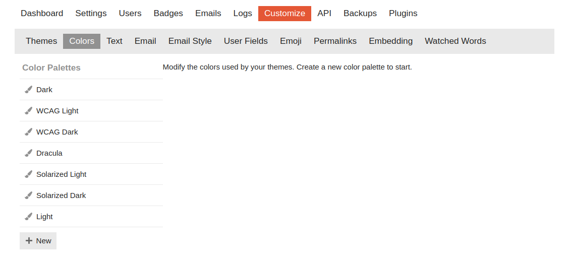
To have the Light scheme on the colors section I’d need to add a new color scheme and then it’s suggested I base it on the default light scheme. But the Light scheme is not present on the colors section by default.
That’s surprising. I wonder if it depends on the color scheme that’s selected when the site is first configured with the setup wizard. Here’s what I’m seeing on a Discourse site I created last week:
If anyone’s running into an issue with there not being a Light color scheme, the method you’re describing should work to create one. Click the “New” button, then create a new color scheme based off the “default light” scheme.
What surprised me was that the first time I tried that after selecting the “Fully” theme on Meta, the try.discourse.org topic was displayed with the Fully theme. I’m assuming that’s a caching issue related to the sites being on the same domain.
Is the issue you are pointing out that the Discourse logo isn’t being replace by the small logo when the hamburger menu is clicked on try.discourse.org?
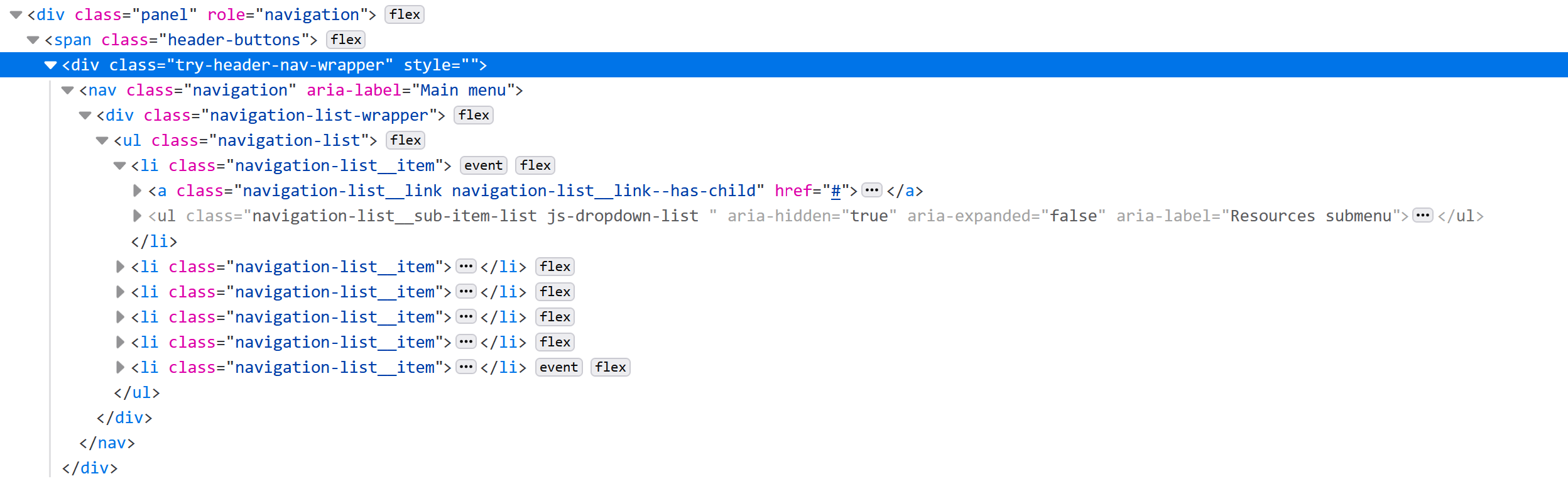
Hmm – The navigation panel on the try.discourse.org site includes an extra div with menu links (.try-header-nav-wrapper) that is breaking the page layout (just on that site) by pushing the header way out to the right when the side menu is hidden, so I see now it’s not a bug in the Fully theme.
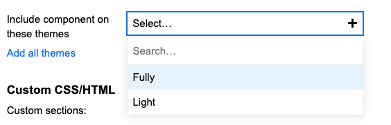
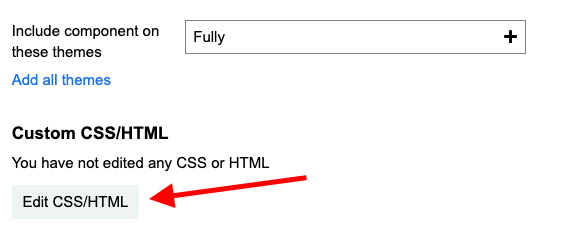
I really enjoy using this theme for my forum, but I’ve noticed that, like the default theme, there isn’t an option to customize the CSS/HTML. I would like to add a background wallpaper to the theme. Is it possible to do that?
Thank you for your response. I believe I saw this somewhere when I searched for “background change,” but I assumed it was only possible within customizing the CSS/HTML of the theme.
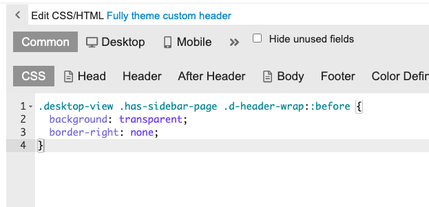
Hey, guys! I love this theme! When previewing it on my site, though, I had an issue with the header of the sidebar navigation. Could just the header use a different color (the normal header color for the site)?
This:
Instead of this:
How can do that? Changing the CSS, the whole navigation got green.
Thanks!
I have the same problem, with my header logo falling across two different colours which looks weird.
I thought that editing CSS in themes was discouraged these days? The CSS editor option has been removed for remote themes so how would we change that variable? That also assumes that we want the sidebar colour to be the same as the header.

")
")
Hosted by us? Themes are available to use on our Standard, Business, and Enterprise plans.
")
")
")


")
")
")
")
")

")
")