I see the same issue with the default Color Scheme (I did not switch the scheme before).
Oddly, the background and the icon use the same --primary-low-mid color, and I can’t see any recent changes around that. 
I see the same issue with the default Color Scheme (I did not switch the scheme before).
Oddly, the background and the icon use the same --primary-low-mid color, and I can’t see any recent changes around that.
Ok thanks for the report, I found the issue and it has been fixed.
Hey guys. I’m using the Air Theme and would like to show the latest posts to the users on the homepage of the forum but Air Theme only shows the categories and there is also no latest activity post shown (like in the default theme).
How can I make it show both, the categories and the latest posts (right below the categories) on the homepage of mobile devices?
It may not be the cleanest way to do it, but add these lines in Desktop css
.topic-list-data.num.views {
  display: unset;
}
td.topic-list-data.num.views {
  display: flex;
  order: 4;
  justify-content: center;
  align-items: center;
}
Can you share a link to your site?
I think this should work for you:
.background-container {
    display: none;
}
Please report back here if it does not.
Hi Jordan,
I am experiencing an interesting effect with setting a Banner with image. It is stretching the image making it scroll horizontally.
While a onebox seems to respect the with.
The below shows the top bar of the banner scrolled to the right centering the cleaning sed and edit
I have tried different image sizes. In the topic user for the banner post displays fine. This also seems to affect YouTube boxes pulled at least using the RSS plugin. Have not tested with regular YouTube onebox.
How can I fix this? And is there a way with CSS to increase height of the visible banner?
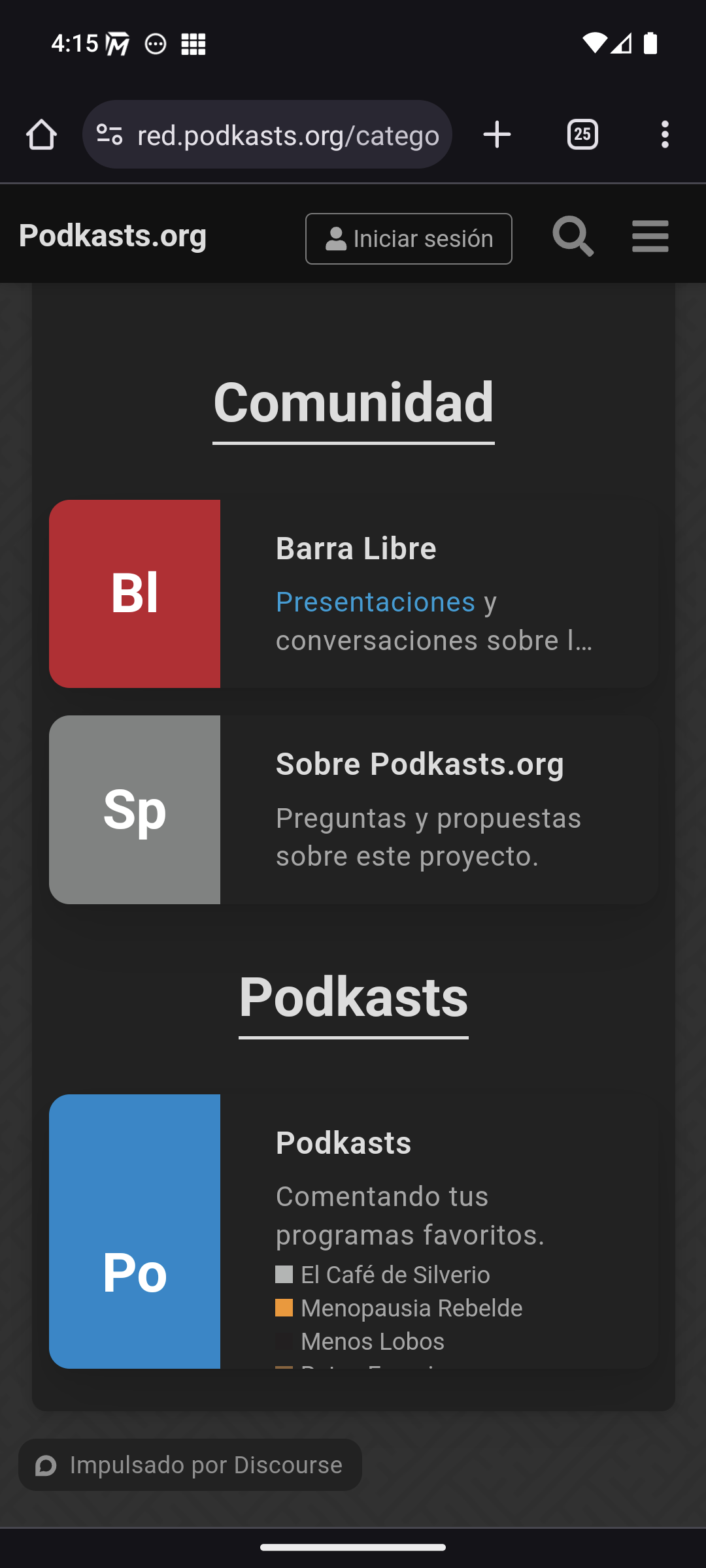
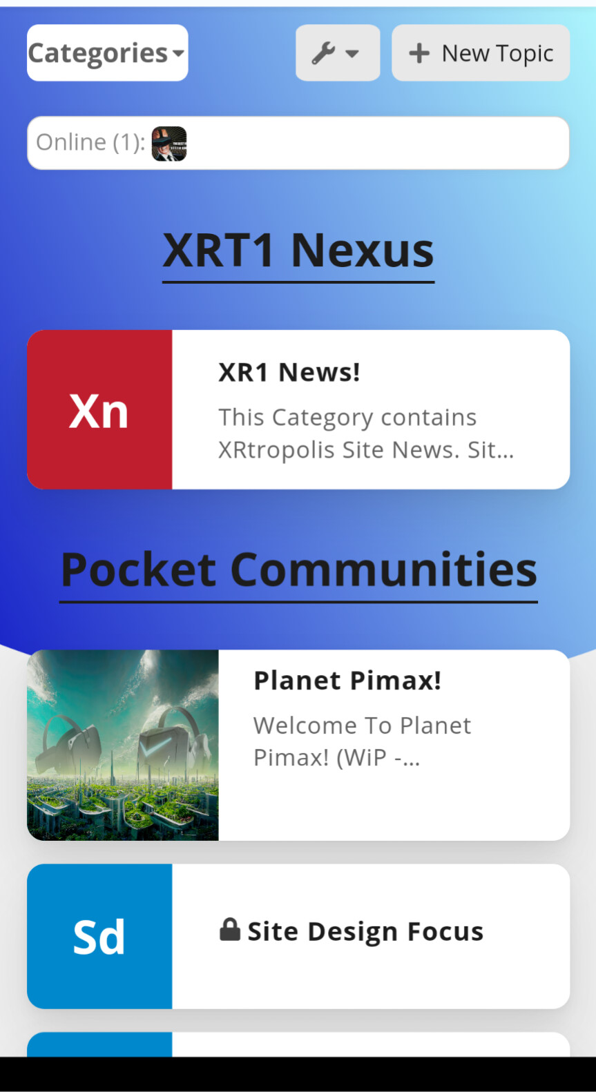
Several people have asked about showing the subcategories in Categories page. This is about the Modern Category + Group Boxes component, but since it doesn’t have a topic of its own (right?) I’ll share my findings here:
This works:
/* Displays subcategories */
.custom-category-boxes:not(.above-discovery-categories-outlet) .subcategories {
  display: inline-flex;
  flex-flow: wrap;
}

.custom-category-boxes:not(.above-discovery-categories-outlet) .subcategory {
  display: inline-flex;
  align-items: baseline;
  margin-right: .3em;
}

/* Removes the category images from the list */
.custom-category-boxes:not(.above-discovery-categories-outlet) .subcategories .subcategory .subcategory-image-placeholder {
  display: none;
}
Also, if you have many subcategories, perhaps you want to show one category per row.
/* One category per row */
.custom-category-boxes:not(.above-discovery-categories-outlet) {
  grid-template-columns: 1fr;
}
The result looks like this:
I think the boxes have a height limit but I haven’t found the way to remove it. We don’t have enough subcategories yet to see the problem on desktop, but we are hitting the limit on mobile:
Any ideas to solve this problem?
I have error responsive with this them by chrome and edge browser, with firefox is OK.
How can i fix it.
Tks you

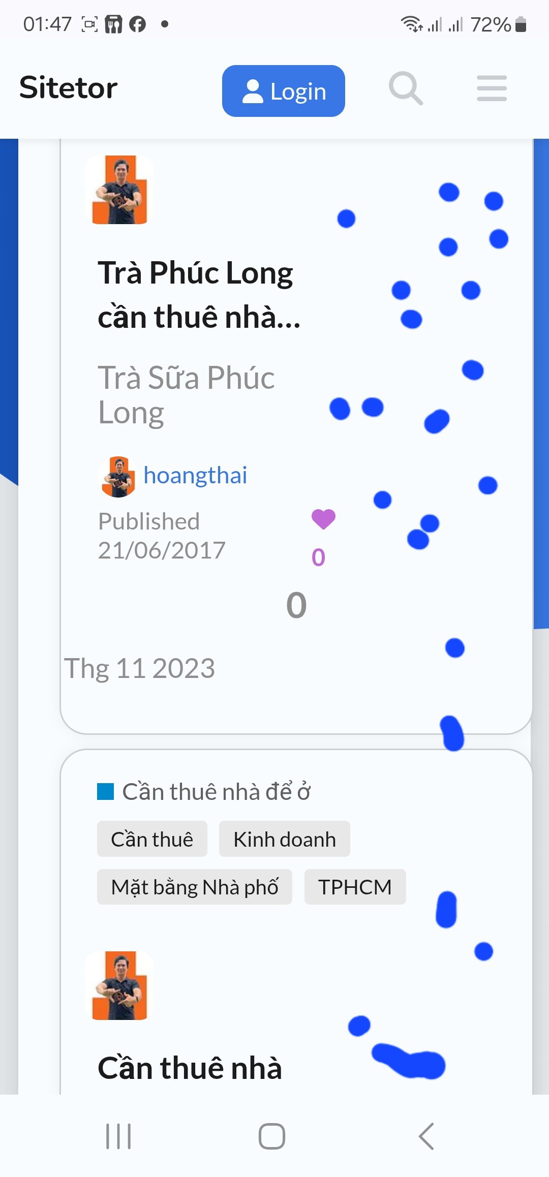
Is there anyway to keep avatars at topic list on desktop in circle format? I checked on mobile it is in circle, but why square in desktop.
Hi on my Air Theme the desktop avatars are circle as per mobile.
Do you have maybe a component that is changing the avatar to Square?
Edit according to Op post looks like should be square…
No, I don’t. I’m using Discourse default theme and Air theme. Discourse default is using circle format. If you look at another board images above, all of them are square.
And the avatars doesn’t look smooth.
Might be able to use this Theme component to correct it.
Exactly what I need to use. Thanks so much!
can someone tell me how to change the background of this theme?
Can you be more specific? There are a few places you can modify th background with a pic.
Hi @jordan.vidrine I have noticed in a couple of spots there is no container around the content.
I would prefer to bubble these elements. As it makes it hard to read when some text for example moves from white background to blue.
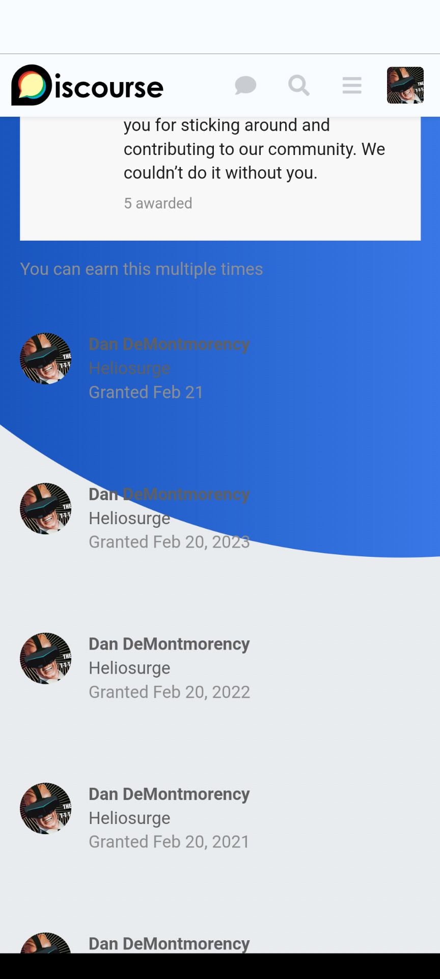
This is badges. But also does it in “Earned …”
I would prefer the bubble vs the straight say white column as I think it has a Nicer effect. This would also be good for other floating elements and even the modern category group headers.
Mod for Air Theme support who’s online plugin
Create theme-component
Edit common CSS and add this code
// Whis Online Customization
.discovery-list-container-top-outlet.online_users_widget {
      display: flex;
      padding-top: .38em;
      background-color: var(--secondary);
      border: 1px solid rgba(var(--primary-rgb), 0.2);
      border-radius: 0.65em;
      transition: box-shadow 100ms ease-in-out;
      box-shadow: 0px 0px 8px rgba(0, 0, 0, 0.05);
}
Enable Component in air theme
Result previous this displayed without background color or border making it hard to see read
There are a few areas would like to fix up that have this issue.
Example shown in my previous post.
EDiT New additional fix for Global banner problem
Additional info on Global Banner Specs:
//global banner image fix
#banner img {
    width: 100%;
    height: auto;
}
Special thanks @awesomerobot for providing this code snippet
Hi everybody, I was just trying to add some custom CSS to this theme but the option is not there together with the other theme customization options. What am I missing?
Did you create a new theme component & add it to in this case the air theme?
You have seen my mods above. Are you trying to override parts of the theme settings or like my post above add mod/fixes?
Thank you Dan! I was able to figure out the adding a new component and then add custom CSS there.
If you’re wanting to Override a setting. Use “!important”
Ie
.some-selector {
    padding-top: 2.5em !important;
{
Still learning myself. Discourse is quite diverse.
Thanks for the great theme. it all works. But I have the question how I can change the background image ?
Thanks for the help
Create a theme component and add this with your background image
html .background-container {
    position: fixed;
    top: 0;
    left: 0;
    height: 100vh;
    width: 100vw;
    background-image: url();
    background-size: cover;
    opacity: 1;
    /* background: linear-gradient(90deg, var(--tertiary-hover) 0%, var(--tertiary) 100%); */
    clip-path: unset;
    background-color: var(--secondary) !important;
}
Hello guys,
Is there a way to add some external links in the header close to the logo?
Thank you!
There is this one
And
There is also one that adds a bar with dropdowns below site header
Hi,
Thank you very much for taking the time to reply.
I was using this one but was not entirely satisfied : Custom Top Navigation Links
Your second suggestion is exactly what I need, I am really happy with the result.
Thank you very much for your help!
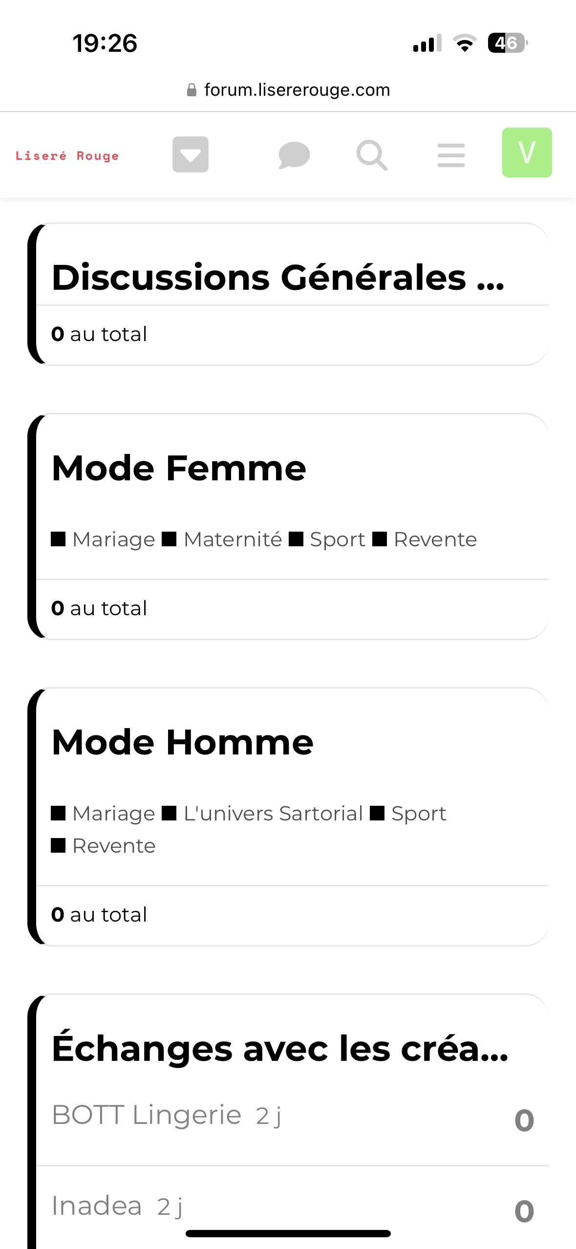
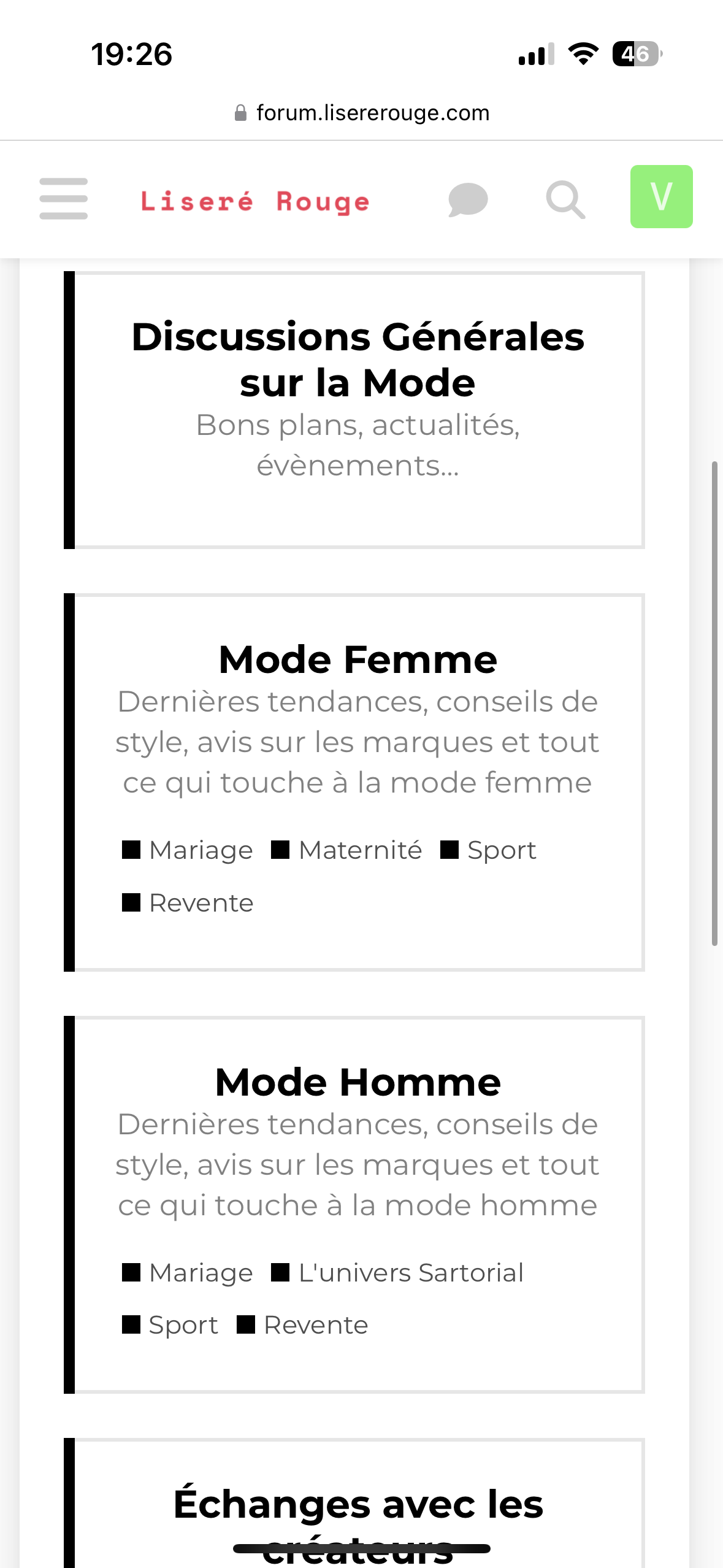
Hello all,
Sorry for this double message but is there a way to show the subcategories on both desktop and mobile and in the same time display the full category titles on mobile when they are a bit long?
My config is CATEGORY BOXES WITH SUBCATEGORIES but without using Modern Category + Group Boxes.
The result is great on desktop and mobile when I use the desktop version. But with the mobile version you cannot read the end of some category titles.
Thanks a lot for your help!
Can you post a ss?
I see subcategories showing in both ss. Are you looking to have category description in both? Or mirror desktop with no desc?
Sorry if I was not clear.
I would like to see the full category titles
For example on the desktop version you have «General discussions about fashion» but on the mobile version you have only «General discussions »
I am not sure the CSS code off hand. But you should be able to have the category title wrap like in the first pic you posted.
Maybe try inspect element on desktop to see if you can identify the CSS used to wrap the category name to use 2 lines.
I tried some CSS with ChatGPT and Claude for example:
.category-box-heading,
.category-box-heading a,
.category-box-heading h3 {
max-width: 100%;
width: 100%;
display: block;
word-break: break-word;
overflow-wrap: break-word;
white-space: normal !important;
overflow: visible !important;
text-overflow: clip !important;
line-height: 1.4;
padding: 5px 0;
}
.parent-box-link {
display: block;
width: 100%;
}
@media screen and (max-width: 767px) {
.category-box-heading h3 {
font-size: 16px; /* Ajustez cette valeur selon vos besoins */
}
}
But it’s not working .
Is there a way to force the desktop view on mobile? It will be perfect to have description and subcategories.
Thanks!
Have you tried how the desktop view looks in a mobile? It isn’t that great in some mobiles.
Disable your custom component. Create a new test component in mobile CSS try this
.category-box-heading h3 {
//* You may need to uncomment the 2 lines below.
//      Overflow: unset !important;
//      Text-overflow: unset !important;
     text-wrap: balance !important;
}
I am pretty sure you will not need any other CSS modifications.
Just tested. Not working with my snippet either.
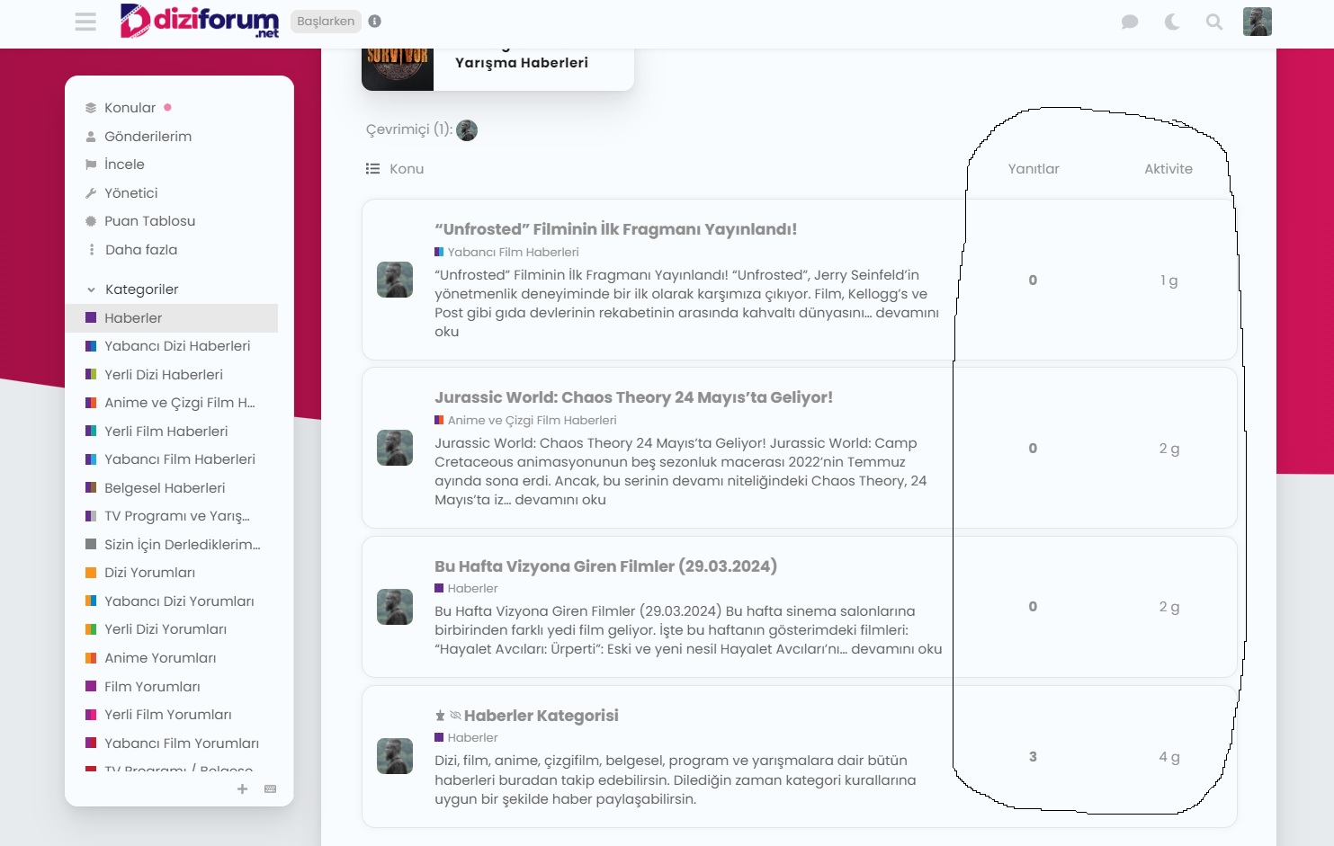
Latest version of effective code:
.full-width .contents .topic-list thead th.posts {
    width: 10%;
}

.full-width .contents .topic-list thead th.activity {
    width: 10%;
    order: 4;
}

th.num.views {
    width: 10%;
    order: 3;
    display: block;
}

.full-width .contents .topic-list tbody tr:not(.topic-list-item-separator) td.posts {
    width: 10%;
    order: 2;
}

.full-width .contents .topic-list tbody tr:not(.topic-list-item-separator) td.age {
    width: 10%;
    order: 4;
}

.topic-list .views {
    width: 10% !important;
    order: 3 !important;
    display: flex !important;
    visibility: visible !important;
    justify-content: center;
}

.full-width .contents .topic-list tbody tr:not(.topic-list-item-separator) td.views {
    width: 10% !important;
    order: 3 !important;
    display: flex !important;
    justify-content: center;
    align-items: center;
}
That’s great. Thank you.
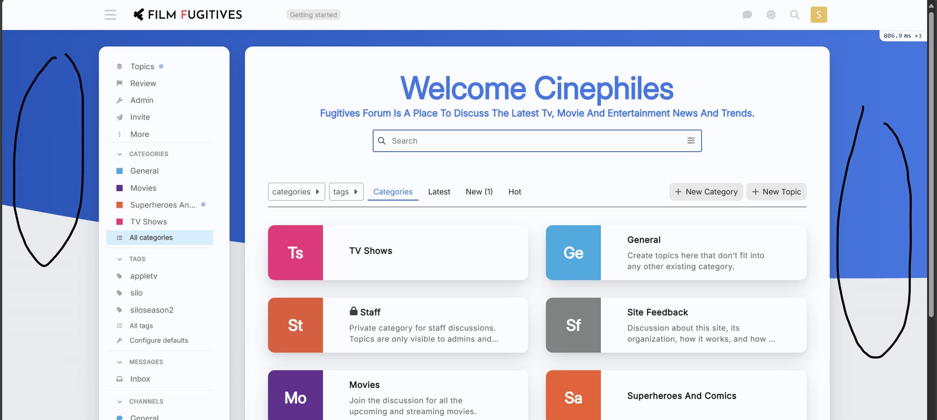
I am trying to change the background of the forum i created using the platform and I am unable to do that with the CSS codes shared in the thread so far. I am quite new to the platform so would be grateful for the help. I am trying to aim for a single color background for the forum, a greyish color. (https://forums.fugitives.com/)
Welcome. The blue part is set in .background-container 
html .background-container {
    position: fixed;
    top: 0;
    left: 0;
    height: 100vh;
    width: 100vw;
    background: linear-gradient(90deg, var(--tertiary-hover) 0%, var(--tertiary) 100%);
    clip-path: ellipse(148% 70% at 91% -14%);
}
You can change fonts from /wizard/steps/styling.
You can change the text color by modifying the color palette from /admin/customize/colors.
I don’t know about the overall style from your screenshot, but for the vertical line, this could help: Line under avatar? - #2 by Canapin
Yeah it also seems to do sideways overflow on Meta here as you showed with the horizontal shifting. I find at times here the texts overflows outside of the boxes in topic lists. Typically iirc in suggested topics but also at times other areas.
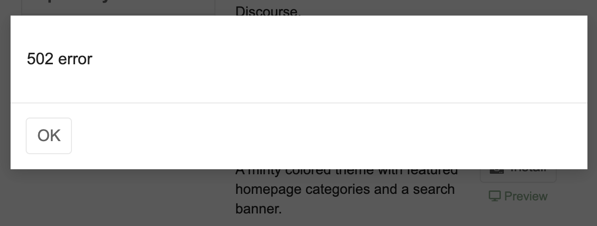
Do you get the same error every time you try to install this theme?
I do! I tried on multiple machines (edit: laptop and desktop, not different servers) as well.
")
")
")
")
")
")
 (864×1920 167 KB)")
")
")
 (1179×2556 253 KB)")
 (1179×2556 228 KB)")
")
")
")
 (1080×2316 167 KB)")
")