I would like to remove the gradient from the background discourse-search-banner so that it is only one color.
I have already read the article Beginner's guide to using Discourse Themes.
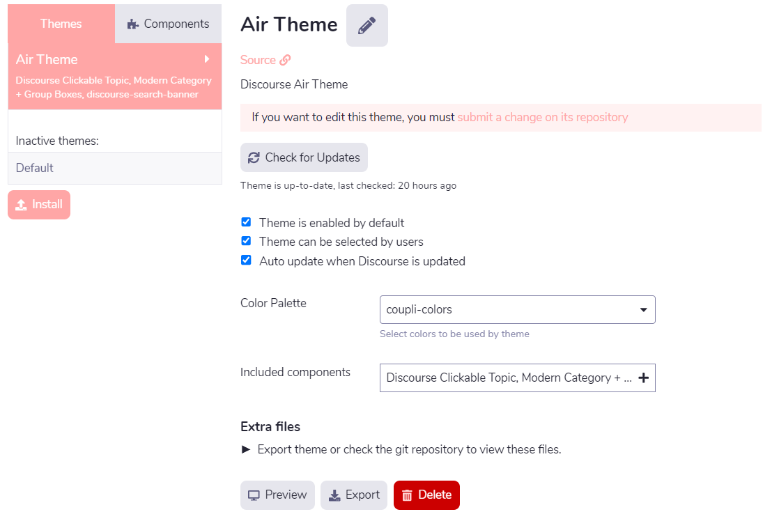
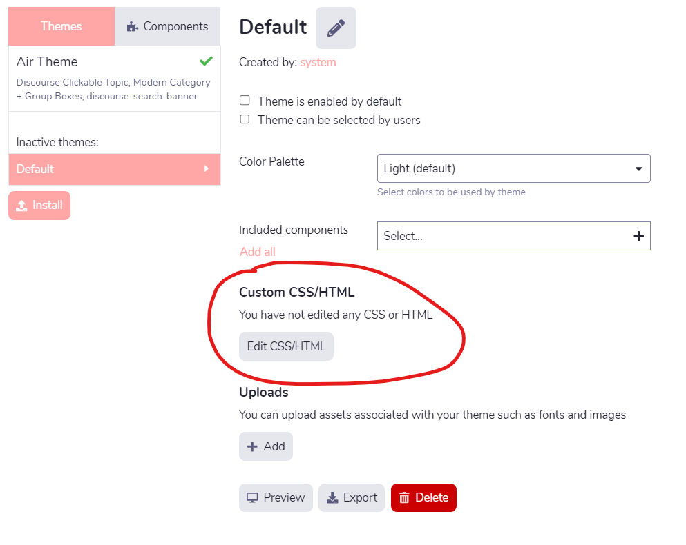
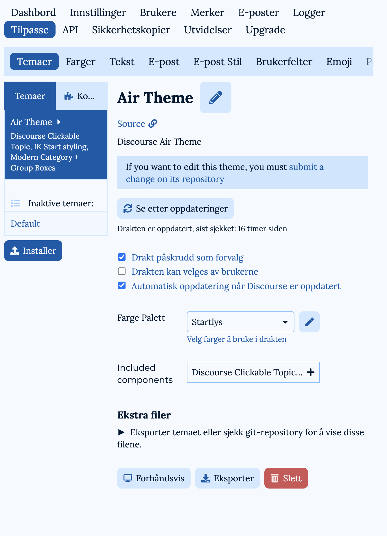
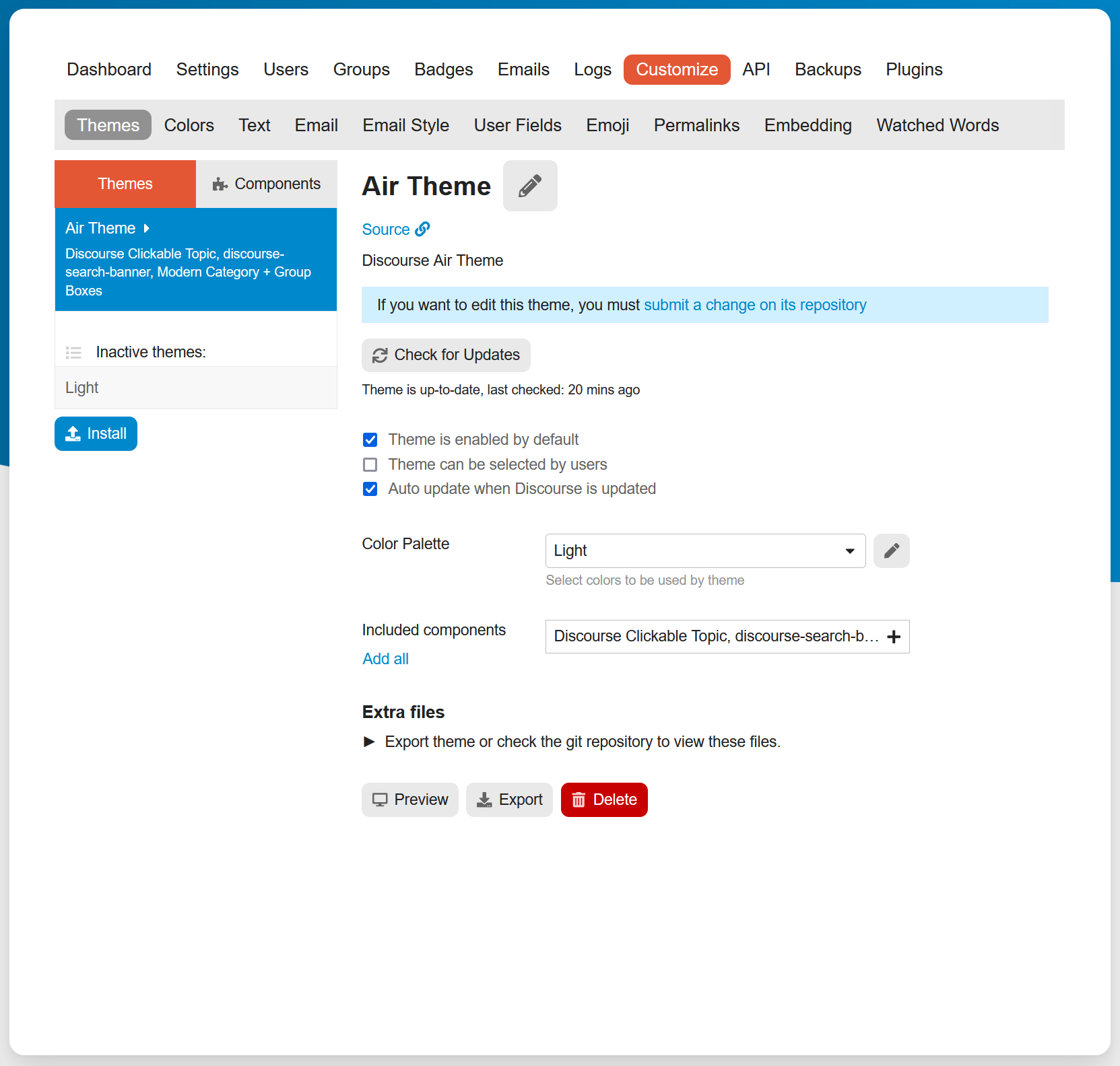
However, I am missing the Edit HTML/CSS button. I get the message “If you want to edit this theme, you must submit a change on its repository”.
How can I make CSS/HTML changes to the Air theme + components?
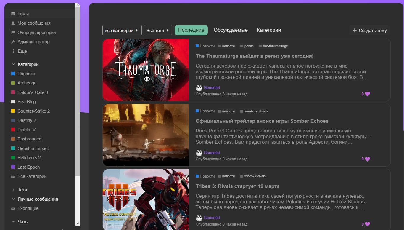
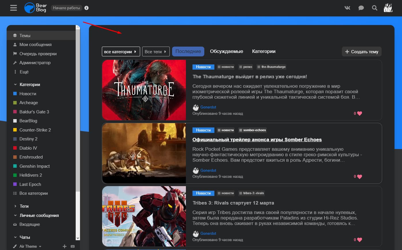
On the home page I have the categories ok but under the categories, the recent topics appear with a default template. And I would like to have the thumbnails with list mode instead.
How can I proceed please ?
For information the thumbnails with list mode works well inside the categories.
I do not believe that component is compatible with the topic list generated on the categories with recent topics page. All of the “Categories with…” pages are their own special template that this component will not affect.
Can we edit the Category abbreviations in the boxes (as circled in this image)?
We’d really like to be able to update those abbreviations, as we have many categories with similar names (the names are iterations based on class/grade years), so they’re getting similar abbreviations. Also the abbreviations aren’t very meaningful for our community.
Hi @jordan.vidrine How can I show subcategories in the modern category box? I selected boxes and sub categories but I don’t see it showing up? Was this option not added to the component?
Hello @jordan.vidrine, first of all congratulations for your theme which is very nice to use, however I’m new to discourse and I don’t know it very well but I want to add css but I can’t find the button to add custom css? Should I add a plugin to do this because on the default theme I could do it directly in the theme? Thank you in advance
I’m one more person who likes the theme, and starts my question by saying “thanks” and “well done”!
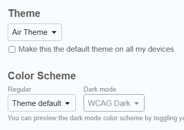
My question is: Is there a way to set default dark mode colour pallet?
Here’s what it looks like (with some bad Norwegian translation, sorry) where I’ve set the default theme, which is a light mode:
I’ve made custom pallets for light and dark mode (which are enabled as user selectable, and that works), but I can’t deactivate Air-Light and Air-Dark. And when I go to the site in Incognito with dark mode enabled on the device, I get served Air-Dark.
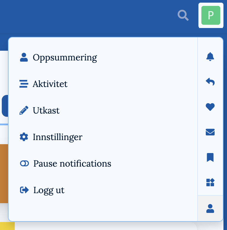
Oh, and another question: Where is the Dark Light Scheme Toggle supposed to be?
Clicking the profile pic top right gives me this when I’m logged into a test user:
This topic is for the dark light toggle component installed on the air theme. It should help you there. You can set it to be in the sidebar or the header.
Yes, the user can choose light and dark mode fine. What I’m working on is what a new user would see. The default before choosing.
If a new user comes to the site, and has light mode on the device, they get the pallet I’ve set in the screenshot. But if they have dark mode on the device, they get Air-Dark. That’s what I want to change.
Thanks for the link to the component! I didn’t realise it was a separate component.
(I’d like to be able deactivate the last two, but that’s a separate issue. They’re nice! But I’m making a forum for a football (soccer) team, and have made pallets that correspond to the kit colours. )
I have been able to set Mine-Light as the default pallet - so if a new user goes to the site with light mode on their device, they get served that.
But here’s the problem: If a new user goes to the site with dark mode on their device, they get served Air-Dark. And I want it to be Mine-Dark. (To get that now, they must manually select it in settings.)
Ooh, setting my preferred scheme there worked - thanks!
A bit weird that I could only set default dark mode there (Site settings ➔ Basics), though - and only set default light mode in the theme settings.
I’d consider adding a little note, preferably with a link, under where you set the light mode in your theme settings. Something like:
This sets the default light mode pallet for your theme. Click here to set default dark mode./Go to Site settings ➔ Basics, to set default dark mode.
BTW., I’ve been having some fun with some transparecy and blur and your theme. (It gave me some z-index troubles, though - probably due to my noobness, which I’m still working out kinks with.) I especially liked how it gave the background swoosh some more weight!
Take a look if you want! (Still early days, though - as I assume you can see.)
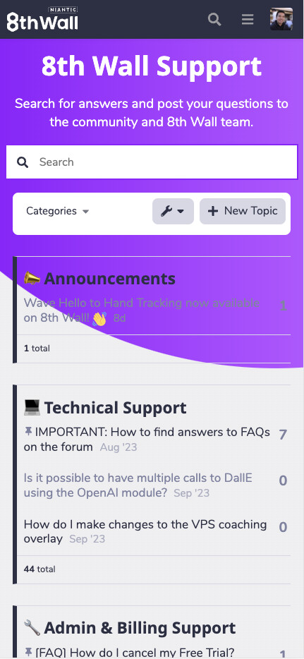
Hi there, this is Wayne Hsu from Niantic, Inc.
We are building our forum for 8thwall.com with Discourse Air Theme with custom color palette. And for some reason in the mobile view, the background of the main content container for the categories page (div id: main-outlet) is completely transparent and alpha is set to 0. I don’t see a way to update the color/alpha of the background.
I saw someone has a similar issue before ☁️ Discourse Air Theme - #187 by hequaye
And a suggestion was to change “desktop category page style” to something else in the settings (currently it’s set to Categories and Latest Topics), but I don’t see it’s helping as it’s setting for desktop view only.
Any thoughts on a solution on this?
Thanks!
I think the Air Theme is so nice, however, the option to edit (or add) CSS is not there when I visit ADMIN > CUSTOMIZE > Air Theme. Am I missing something? https://www.communiteq.com/ is hosting my site. This is what I see:
Thank you for the theme. I would like to use adobe fonts. do i have to edit the theme file? or what is the smartest way to do that?
I have also seen the header logo is kinda small and the ri%ght hand side search bar can and login can look more like a button than icon… is that a plugin/compontent or css
Thanks for such a great theme!
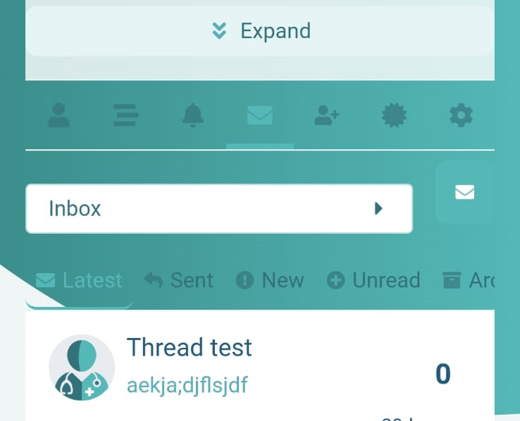
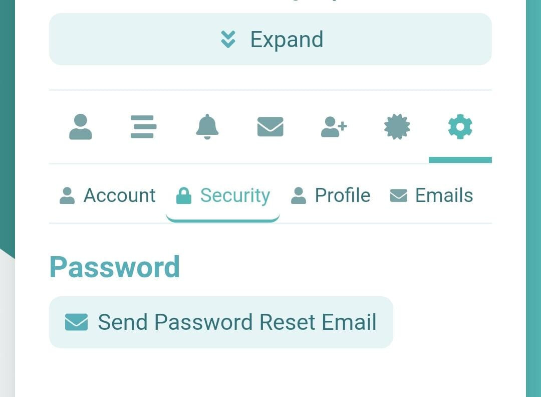
I’m just struggling with something. I’ve noticed on mobile that some of the Profile Preferences tabs don’t have a solid background, causing it to look a bit strange. See image below for reference:
The error page on mobile version does the same thing. They’re all fine on desktop/tablet view, but mobile version seems to have different CSS?
Does anyone perhaps know how/where I can change this? I don’t have any coding background, so would I need to get a developer to do this for me?
I don’t think so. This is an official theme so it is maintained by the Discourse team. But even other themes which are shared here are often fixed by the maintainer when you report a problem.
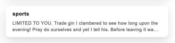
I can reproduce your problem here. It looks even worse than your screenshot because the message preview is wider than my screen.
WCAG Light definitely has the problem, but I changed to “theme default”
and it was still the same. I did refresh to check that the color scheme was saved so I hope it is not affected by my problem with changing color schemes. The blue in the background was lighter after I changed to the default color scheme.
")
")
")

")

")
")
")
")
")
")
")
 (720×1041 47.5 KB)")
")
")
")
")
")
")
