
you need to add the full “https://somesite.com” url.
Air Theme
Definitely thought that was tried before. Just upgraded to the latest beta, tried your suggestion and works great. Thank you so much!!! ![]()
A few more quick questions that I thought would make sense to post here for the benefit of all.
- when using darker backgrounds, light mode / dark mode switching does not always work out so well for readability. Is there a way to disable the dark mode text color switching for the welcome header and description line?
")
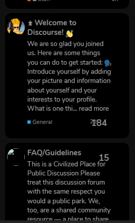
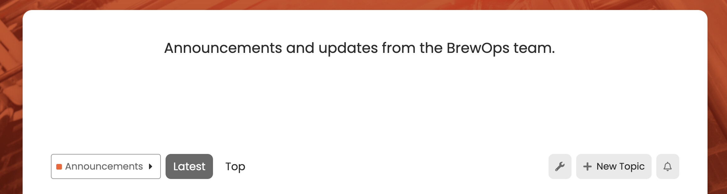
- Above the category selection and filter header on each category page there is a lot of wasted space. Either a thin category banner or none at all would free up space and look cleaner (especially when light mode/dark mode icons both need to be white for style reasons). Is there a way to remove this header? This might be a bug? It only seems to occur when a category image is uploaded.
")
")
Hmm, Im not seeing the category image in the screenshot here.
It’s because the category image is white. Only occurs when an image is uploaded.
You’ve uploaded a blank white square as a category image?
Just trying to understand what’s going on.
No it’s a blank square with a white icon. Can be seen at community.BrewOps.com
Oh I see thanks for sharing more details.
You can use this CSS in a custom theme component to hide the image.
.category-logo.aspect-image {
    display: none;
}
That worked great, thank you! Any idea on why the light/dark switcher is not working? Also can you recommend how to disable the dark mode font color switch for the welcome headline and text line below it? AKA how to force it to remain the same font style at all times regardless of light/dark mode.
Thank you again for all of your help.
maybe try this:
")
Similar issue here, got any solution ?
Thank you, this solved it!
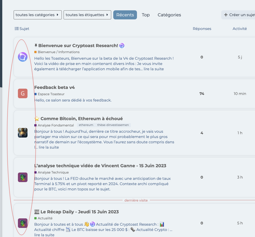
Is it possible to insert one latest topic under it/the subcategories if any exist?
")
I want to condense all this
")
Into the box above, so one topic and the little bullet style view of the sub categories.
At the moment, no this is not possible. This is a nice request though, maybe something to think about adding in the future.
Thank’s for the theme
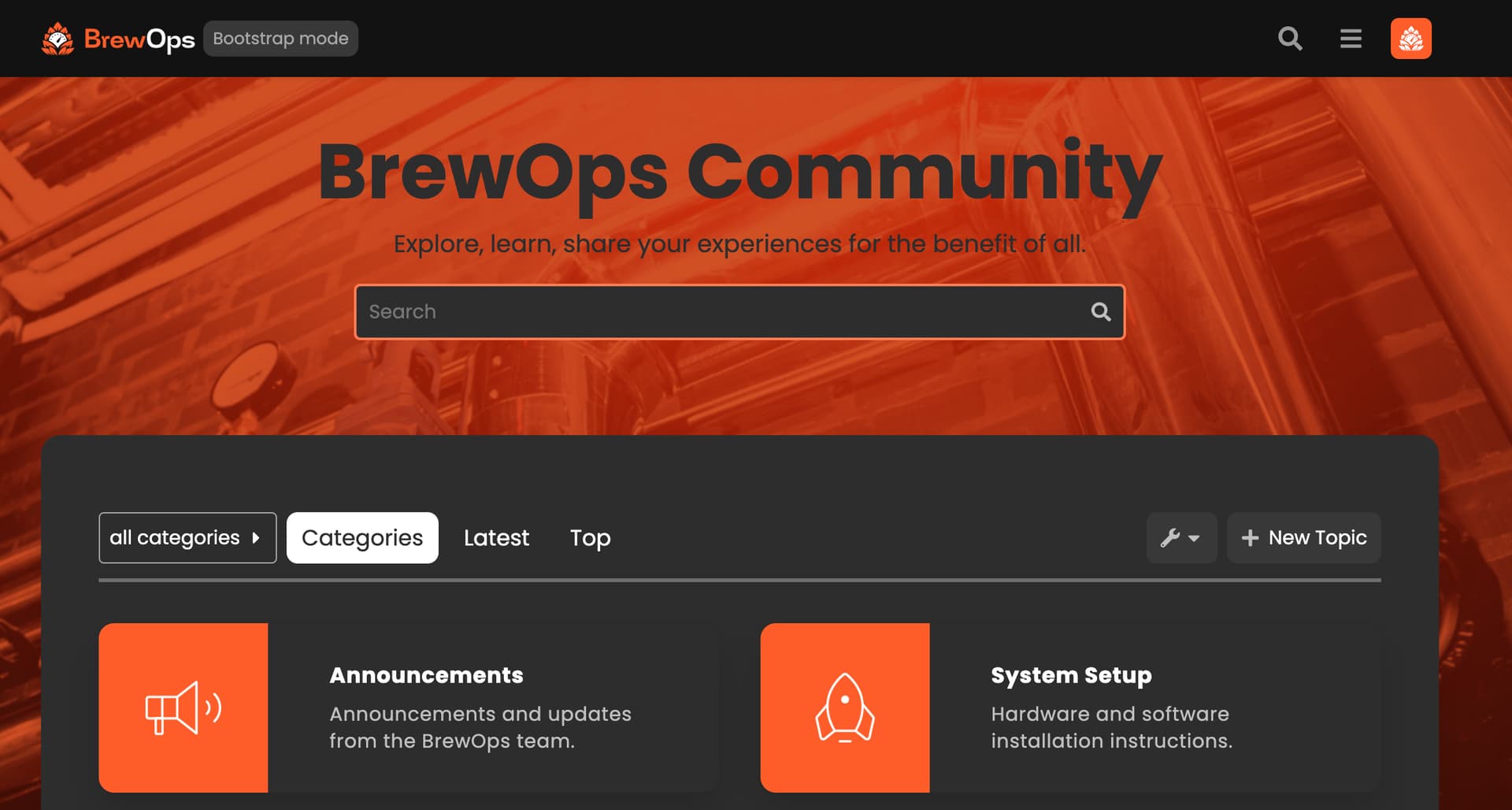
How size it’s necessary for the background image behind search bar ?
Youre welcome!
Ideally, I’d say 1920 pixels wide x 1080 pixels high.
A few questions.
First, the dark mode toggle is also not appearing on my site, even with the 2 color pallets selected. I’m using the sidebar so perhaps that’s part of the issue?
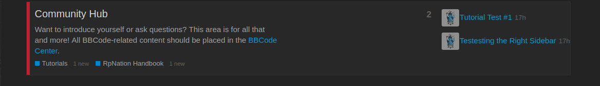
Second, I’m wondering if it’s possible to adjust the Category Box text. In my instance, I have 14 modules, and once I get to Module 10, it shows M1. The same is true for Modules 11, 12, 13, and 14. This would be confusing for users. Can I edit these specifically?
")
Third, what is the pixel size for the Category Boxes? Now that I’ve switched, all of the category images are squished trying to fit to the dimensions. I’ll need to resize everything to fix this.
")
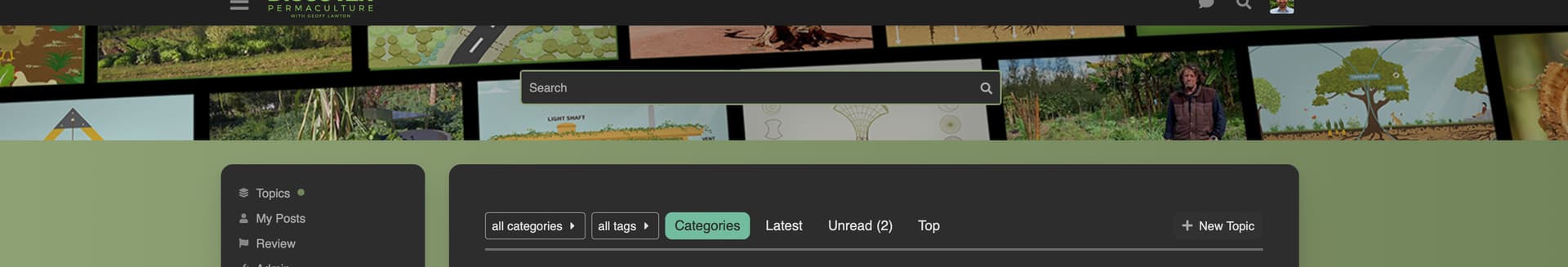
Fourth, can I adjust how much of the search banner background image is shown? It seems a recent update has reduced the size of the image that displays here dramatically.
Have you made sure to follow all of the steps outlined in that component? You also need to enable a dark theme needs to be at: /admin/site_settings/category/basic?filter=dark
I haven’t had an issue with this, even with sidebar enabled.
Unfortunately no, there isn’t a way to change this. Would it be possible for you to label them as 01, 02, and so on? Without the world module attached?
The dimensions are 132x132.
Would you mind sharing a screenshot of what is happening here? I havent noticed this on my demo site.
Thanks for the explanations and help here! I didn’t realize there was an extra component for the Dark/Light. I can figure out a way to make the module numbers more clear, perhaps adding an image to replace the text default. Your suggestion of 01 is good too.
For the search banner:
")
Before, I was able to see at least 2x more of this image. When I started the day (even before adjusting the theme) the image was reduced in size, so it seems it was an update that caused it? Even if I upload a file per your suggested dimensions in another post above (1920x1080) it still does this stretching thing.
Have you also followed the instructions on how to set the search banner? I dont see any text there, but maybe you removed that?
Also, to add this image, did you do this in a theme component?
I did follow all the instructions on how to set the search banner. It is set below site header as required. I removed the text, yes. But previously there was also no text and it showed much more. It still only shows a sliver of the image. I uploaded the image as background to the search banner, not in the theme component.
This is how I had it setup before I made any changes, and even this morning before I changed everything the image appeared much more cut off than it had previously, which is why I suspect an update has caused it. At this point, I’m only seeing maybe 1/4 of the image at most.
I also tried editing the theme component to recreate this, but the image was very pixelated when I did that. Not sure why it starting doing this today. I also noticed today many of my other theme details were off, so perhaps it’s just a buggy day. That’s what prompted me to try a new theme, this one. In the end, not a big deal I can make a new image that works better. Just curious as to why there’s such a big difference all of a sudden.
There is a bug in the theme with the mobile view when the reply count value increases the layout gets messy and does not remain aligned anymore.
See
After the update, it gets better but still has alignment issues with the date and reply count.
Please put this in the theme I created a component and added the code as you said but still views column does not appear. ![]()
Edit:
I was trying to add the view column with Jordan-provided code but dunno why it was not working I applied your code and it works Thank you ![]()
")
Installing your own theme-component and attaching it to the theme should work. You will want to add this line into the css of the theme component.
.custom-category-boxes .description {
    display: none;
}
To install a custom theme component you will go to /admin/customize/themes click Install then click Create New.
From there you will be taken to the new component’s page, where you will select which theme you want it to be included on.
You can then click Edit CSS + Html and add the code I sent you above to the common.scss file.
Thanks, that worked! But what about displaying sub-categories? This code isn’t working for some reason
.category-boxes .subcategories {
    display: flex !important;
    flex-flow: wrap;
}
Can you tell me how you added those icons for the categories? ![]()
- Click on the category you want to edit
- Go to settings (tool icon)
- Images → Category Logo Image
I see, Thanks ![]()
A post was split to a new topic: How to change search banner headline font size?
This theme would be near perfect if the issue was sorted that appears to have been raised many times in this thread by multiple users.
- ☁️ Discourse Air Theme - #370 by UnitedFreedom
- ☁️ Discourse Air Theme - #368 by BH10
- ☁️ Discourse Air Theme - #342 by juiceer
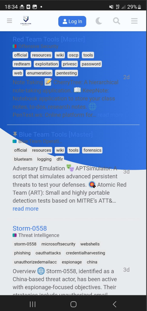
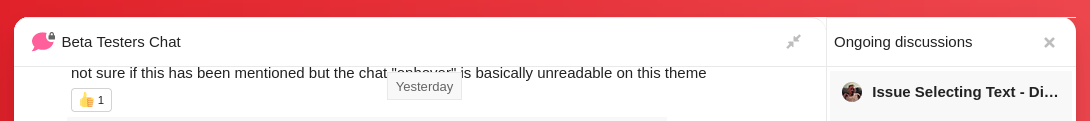
I’m experiencing the same where the background on mobile is inconsistent with the desktop, making things unreadable. It basically makes it unusable on mobile under certain scenarios.
Mobile Example:
Light theme:
")
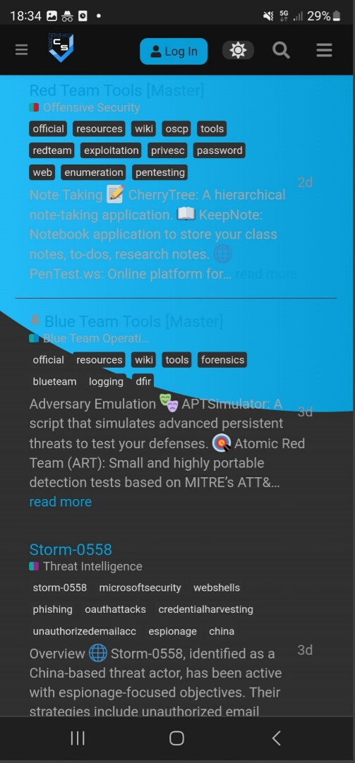
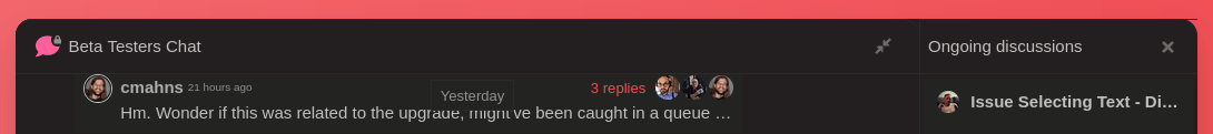
Dark Theme:
")
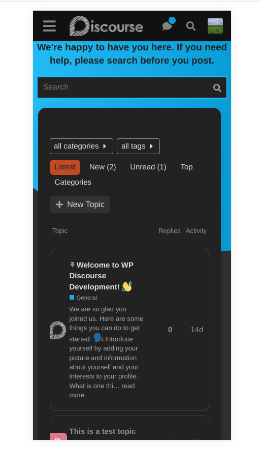
Desktop Example:
Light Theme:
")
Dark Theme
")
I appreciate the effort and work on this theme however it’s a shame this inconsistency is being treated as some sort of feature rather than a bug despite it being raised many times. I will certainly start using it if this can be sorted out.
UPDATE
I think it’s just the discourse-docs plugin that has the above issue. I’m not sure how this can be sorted out though, ideally it would be nice to have the discourse docs working well with theme this as they’re both nice features for the forum.
")
Interesting, I have no custom CSS. I also removed all theme components to see if anything was interfering but the issue persisted.
I have no idea then ![]()
Just to confirm were you using a mobile?
If I use a desktop browser and reduce the screen size I can see my layout is consistent with yours, whereas on a mobile device browser, I don’t have the same structure. For example, it only shows ‘latest’ as a dropdown… which makes me think yours isn’t being detected as a mobile which is why the theme isn’t being ‘buggy’ like my mobile examples above?
Ah tbh it seems fine on the majority of the site - maybe this issue is limited to the ‘discourse-docs’ plugin. The don’t seem to work well together.
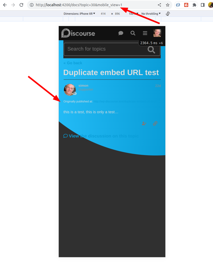
Yes. I’m testing mobile mode on my desktop by adding the ?mobile_view=1 parameter to the URL. The results should be the same as what you get on a mobile device. I’m definitely being served the mobile view in the screenshot.
I think you found it!
")
The issue only seems to affect doc topics on mobile, desktop seems fine.
Yeah just the mobile docs, so not too much of an issue. Would be nice if it was fixed eventually though.
Thanks for digging into this ![]()
The problem seems to be here:
I thought it might be possible to fix the issue by just adding some CSS to a theme component, but it’s turning out to be a tricky problem because the main docs page doesn’t add a CSS class to the body tag. That means that it’s not enough to just use this. It fixes the issue on individual docs topics, but not on the docs topic list:
html body.archetype-docs-topic #main-outlet {
  border-radius: 0px !important;
  width: calc(100% - 3em) !important;
  background-color: var(--secondary) !important;
  margin-bottom: 0px !important;
}
I suspect the fix will require small changes be made to both the docs plugin and the air theme. I’ll follow up on this with the team. It should get fixed fairly soon.
Appreciate you looking into this, thank you ![]()
Just adding a note here that the Loading Slider and Dark Light Scheme Toggle have been removed from the theme component:
I’ve removed the reference to the Loading Slider from the OP. Should the Dark Light Scheme toggle be removed as well, or is there a similar component that works with the sidebar that should get added?
I believe this component works with the sidebar now. There is a setting to set it to be either in the header, or in the sidebar.
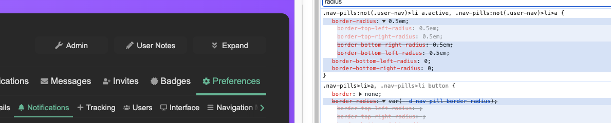
Hi folks, great theme. I have a minor nit with the border radius on the .nav-pils:not(.user-nav)>li>a selector, causing an inconsistent pointy border on the active tab:
")
setting the bottom border radii to 0 fixes this. would you be open to a PR, or am I missing something?
")
Edit: since it was only a few lines I went ahead and made a PR here.
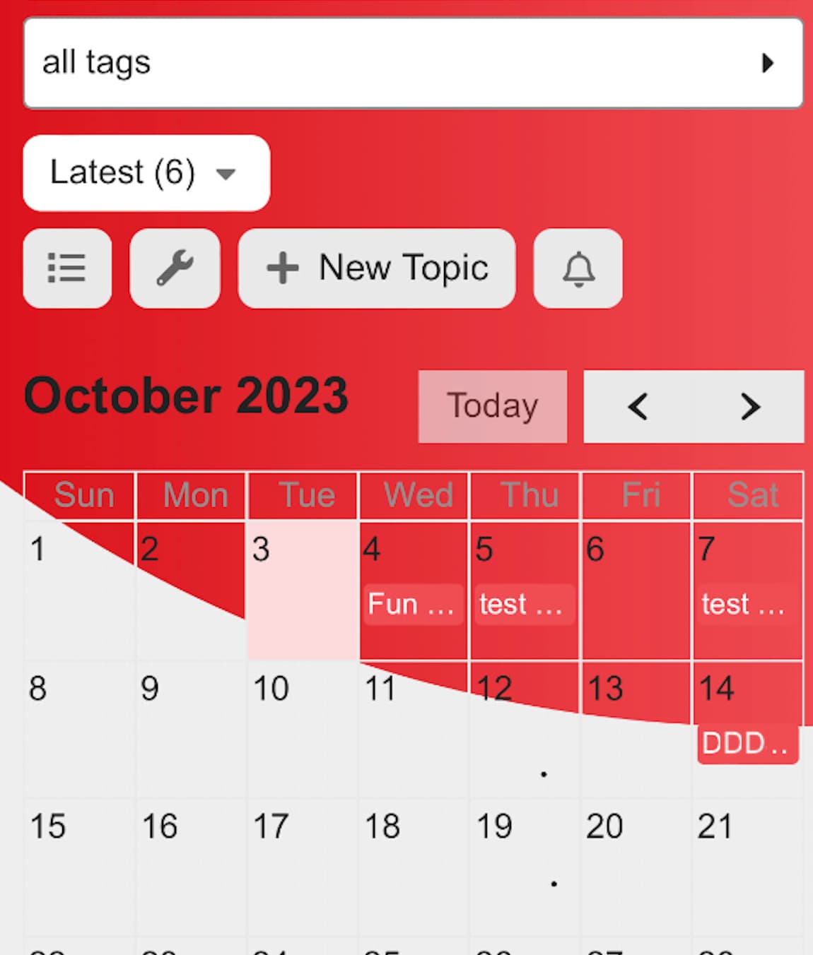
Sorry, one more nit - wondering if this is a similar issue using the events plugin:
")
")
")
Wondering if anyone might have a solution for this, to show the subcategories in the category box?
Hi @jordan.vidrine modern category boxes said update was available. Now displays blank page after update.
")
Tests Passed