Even if an image is added to the Poster image (optional) setting in ‘Discourse Insert Video’, it is not displayed in the feed on the site’s main page. As usual, only the first image of the video is displayed.
Hello it looks like this is not the latest version please update the theme. If the issue still exist it is maybe the same kind of like FKB Pro - Social theme - #221 by LoveMCJ.
The Collapsible Category Groups gets too squeezed on smallish screens )anything under 13.5’) by the right side module. Making that side module collapsible or forcing a minimum width on the categories in that plugin would solve it if you wanted to do so.
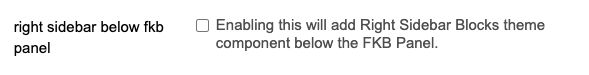
The original fkb panel looks balanced with it, but enabling the “Enabling this will add Right Sidebar Blocks theme component” does not look as balanced as the original fkb panel. Can you adjust the 3 columns to look balanced like the original fkb panel when using the “Right Sidebar Blocks theme component”? Thank you very much for your support.
@Don
Hi,
I’ve applied the ‘Custom embedded replies (theme-component)’ to the ‘FKB Pro - Social themed’. It’s not bad on the desktop, but on mobile, the right comment column layout is quite narrow, and the ‘Jump to post’ icon is also attached to the bottom. As a result, the space on the left appears quite wide. Do you have any plans to arrange the thread and user icon on the left column part as far to the left as possible, and adjust the layout to balance it so that the comments can be seen a bit wider?
Is it possible to use the Right Sidebar component with the “stock” FKB panel? so that the top section is FKB panel but below it is the rest of the Right Sidebar component?
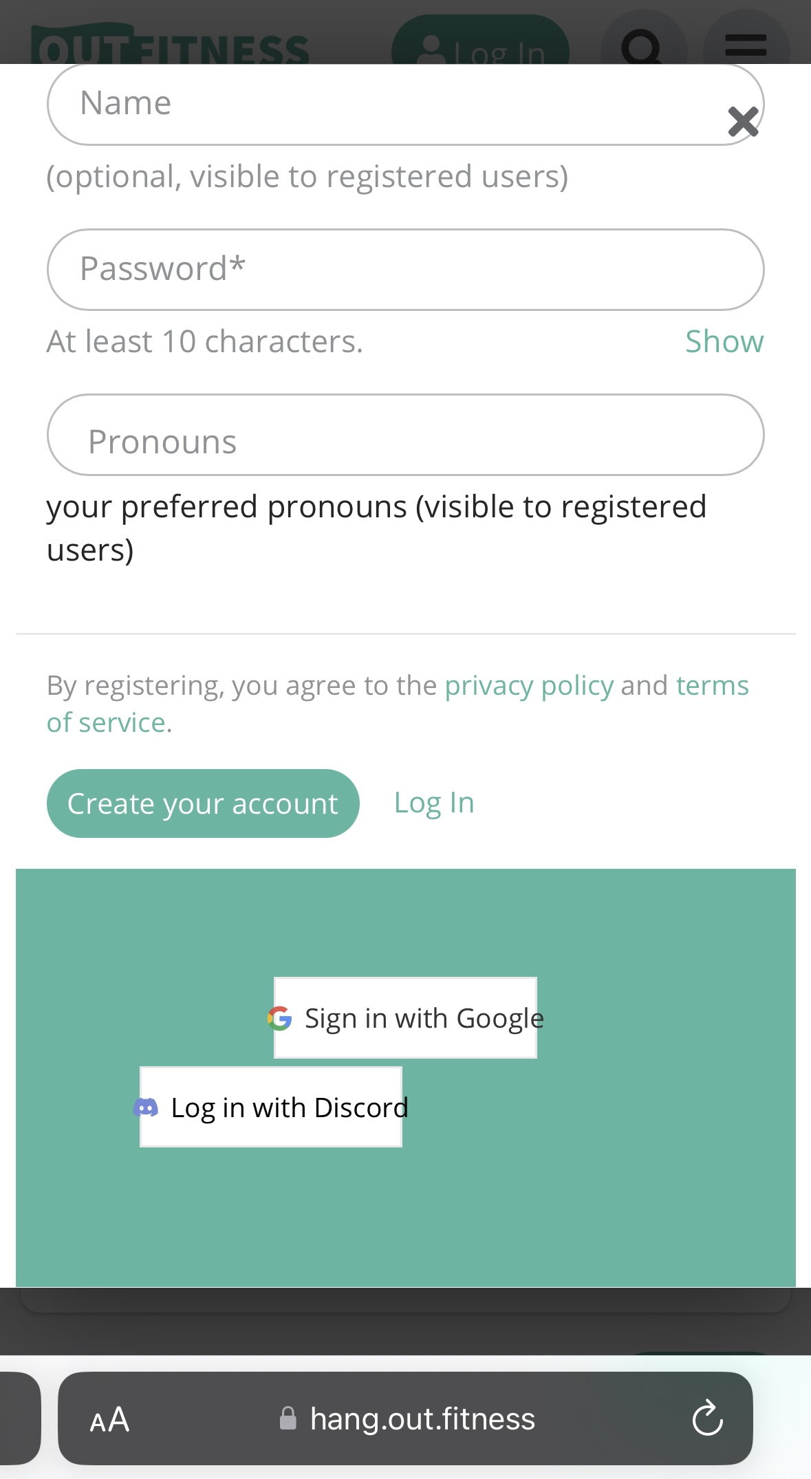
On the create account modal, I’m seeing the third-party login buttons improperly aligned. Only happening on mobile (and scaling text size to 75% snaps them back into alignment). I’m wondering if this is a FKB PRO error or not?
They look correct on my sign in modal, only the account creation one is messed up. Otherwise this theme has been BEAUTIFUL, thank you!
With settings editor you can do the same when you change a theme setting. So in this case you can change the colors. These settings are restricted. If you want to make bigger changes on buttons etc. You have to create a new component -and activate it to the theme- where you can place your code.
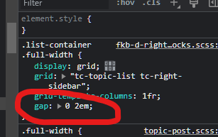
I am not too familiar with kanban CSS but I think the data-category-id is should be a number.
Hello @Fma965, Yes, technically it’s possible. Now it works like when you use the right sidebar component then the default section is hidden but it possible to use the both together with some CSS I think.
Hello @thisisjoshjones, Thanks Yeah I think, I have to update the theme CSS to suits the new core modal changes. I’ll fix this.
I have an issue: on the last version of Discourse 3.2.0.beta4-dev there is no link to edit the CSS/HTML in the theme panel…
Just wonder to know if this issue is only with my version of Discourse or if somebody that made a fresh install or update to this last Discourse version has the same problem?..
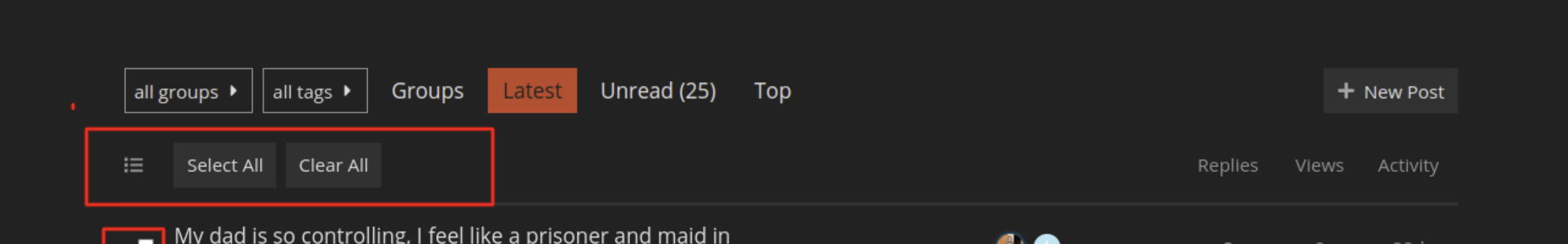
Hi @Don I’ve tried out the theme and noticed that the bulk select doesn’t work and the topic-list-header has been removed. Was this intentional? And is there any resolution for this?
Yeah, that was because the layout and the template changed and the bulk select etc need to removed. But I am working on implement the bulk select to this theme.
Greetings. The theme is simply great, the only thing that bothers me is that if I update the material or someone leaves a comment, the theme rises to the very top. How can I output all output material strictly sorted by date added and so that nothing affects it? I will be very glad to see your answers, in two days I have not been able to move forward in this direction…
I am not sure what you mean exactly but if your question is about the bumping than you can have a few options to handle it.
When you edit the latest post or add a new post in a topic then the topic will ordering to the top of the topic list. You can reply without bump or after the post is published and the topic bumped you can reset the bump date.
That’s right, I’ve seen it… So there’s no way to turn off the topic bump altogether? I’m just trying to do something like a social site and the bumps aren’t needed at all)
sorry for my english, this is a translator…
The /latest view will always show you topics with the newest change of the last post. It is designed to keep track of everything new.
You could use ?order=created to create a topic list, where topic appear in the order they were created. Here is an example for this forum: https://meta.discourse.org/?order=created
By desing Discourse is not a social media, even there is some aspects and mostly by tuning up with some plugins and components.
What if would take totally different direction? If you are looking for strongly social media then you could install a mastodon instance. And still you have option to use Discourse side by side with mastodon for more forumtype use.
I’ve been doing a https://dtf.ru type site for a year but have run into the fact that I need to structure my posts. Almost 3 years ago I installed Discourse, but back then it looked like a regular forum and as far as I remember I didn’t see your theme. But here after a long time I happened to see your theme and it is just delightful.
People and I can write posts, guides, etc and yet you can structure everything perfectly and I liked the core of Discourse itself back then (but not the visual).
Now it’s a great tool that both looks and works great. It is better to use crutches in implementation, but with a powerful tool and a huge user base, than to use something less popular in my country in terms of visuals and practical application.

")
")
")
")
")
")
")
")
