Hello @ammar37,
You can hide it with CSS.
Create a new component in admin and paste this in the CSS section:
.topic-list .main-link.focused {
  box-shadow: none;
}
Hello @ammar37,
You can hide it with CSS.
Create a new component in admin and paste this in the CSS section:
.topic-list .main-link.focused {
  box-shadow: none;
}
But the default light theme looks okay because it’s displaying the line at the far left edge of last-visited topic, as opposed to the Discourse Air Theme which is showing in between user avatar and topic text.
I was trying to identify the CSS too… 
Thanks for your help. I tried adding the css into an existing component (which I use to modify css for this theme), the code unfortunately does not seem to work so far.
[EDIT] The code is working, I actually copied your older code (.topic-list .main-outlet.focused) instead of the latest one (.topic-list .main-link.focused)
Thank you so much. Appreciate your help @Don 
I tried it now with Discourse Air theme and it works fine for me.
Could you try add it again? I changed the code in the first few minutes maybe you was fast and copy the wrong one.
Nice. It’s working great now… Yeah, I actually copied your old code (.topic-list .main-outlet.focused) instead of (.topic-list .main-link.focused)
Thank you so much. Appreciate your help
Change your color scheme, the circle follows tertiary and tertiary=hover
is there an option for custom HTML to the head in this theme?
Hello again @jordan.vidrine
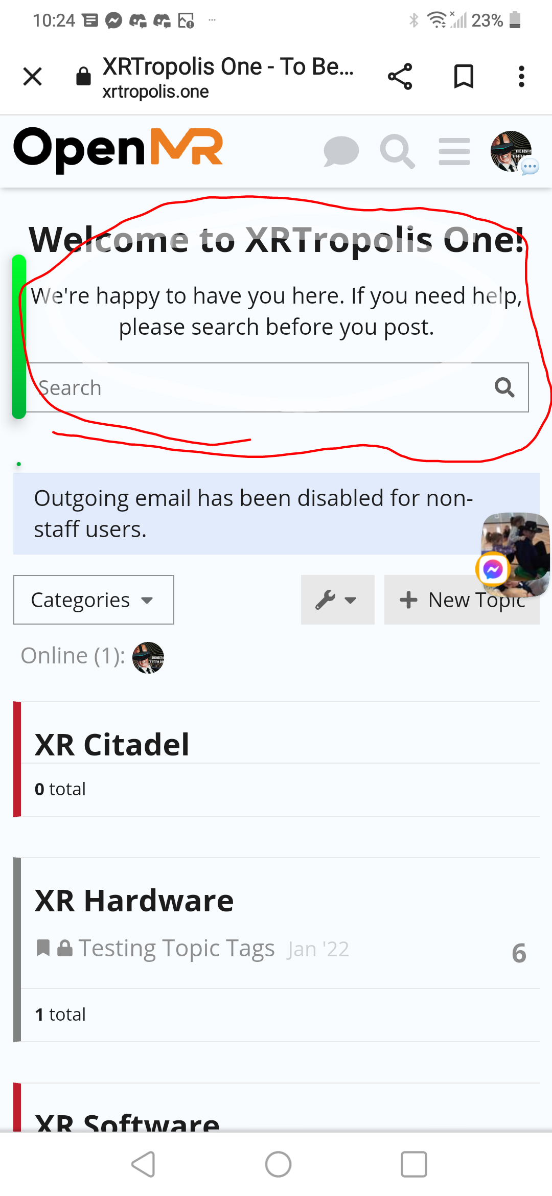
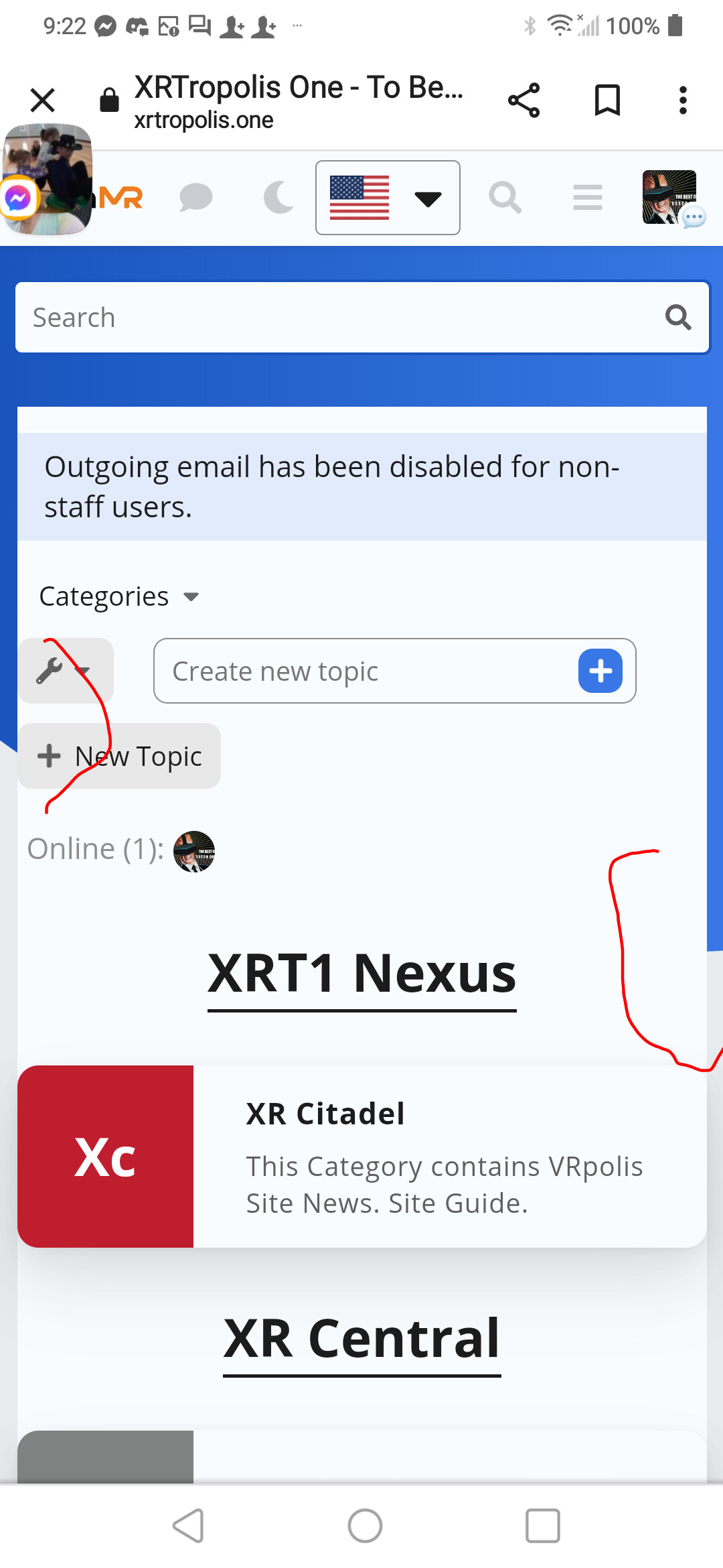
Is it possible to make this section visible on mobile? Category boxes + Latest post below.
Thank you in advance. 
Hey there,
I really would like to use this theme, but on the topics view user avatars are VERY pixellated. Is there any way to make it use a higher quality user avatar image?
The theme isn’t taking the light logo when I switch to light theming. It only retains the dark logo.
The following merged PR fixes the issue with clicked topic list items & selected topic list item styling.
Sorry about that! I believe this may have to do with the new sidebar we have enabled on meta. I have disabled this theme for selection on meta for now.
Well, actually this issue has existed for like 2 months.
Oh wow, sorry about that! I’ll look into it when I get some free space.
Thanks!
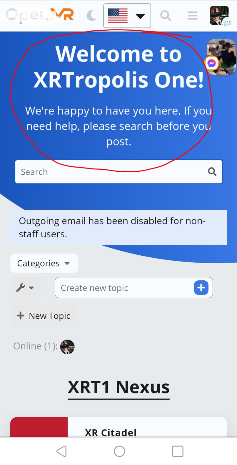
Hi, love the theme! One question, not sure if this is the right place to post… but is there a way to put the categories on the left and recent conversation on the right? Would appreciate any help since I am really not technical and have not found a way to change it. Thank you!
You will want to add some custom css:
html .background-container {
    background-size: cover;
}
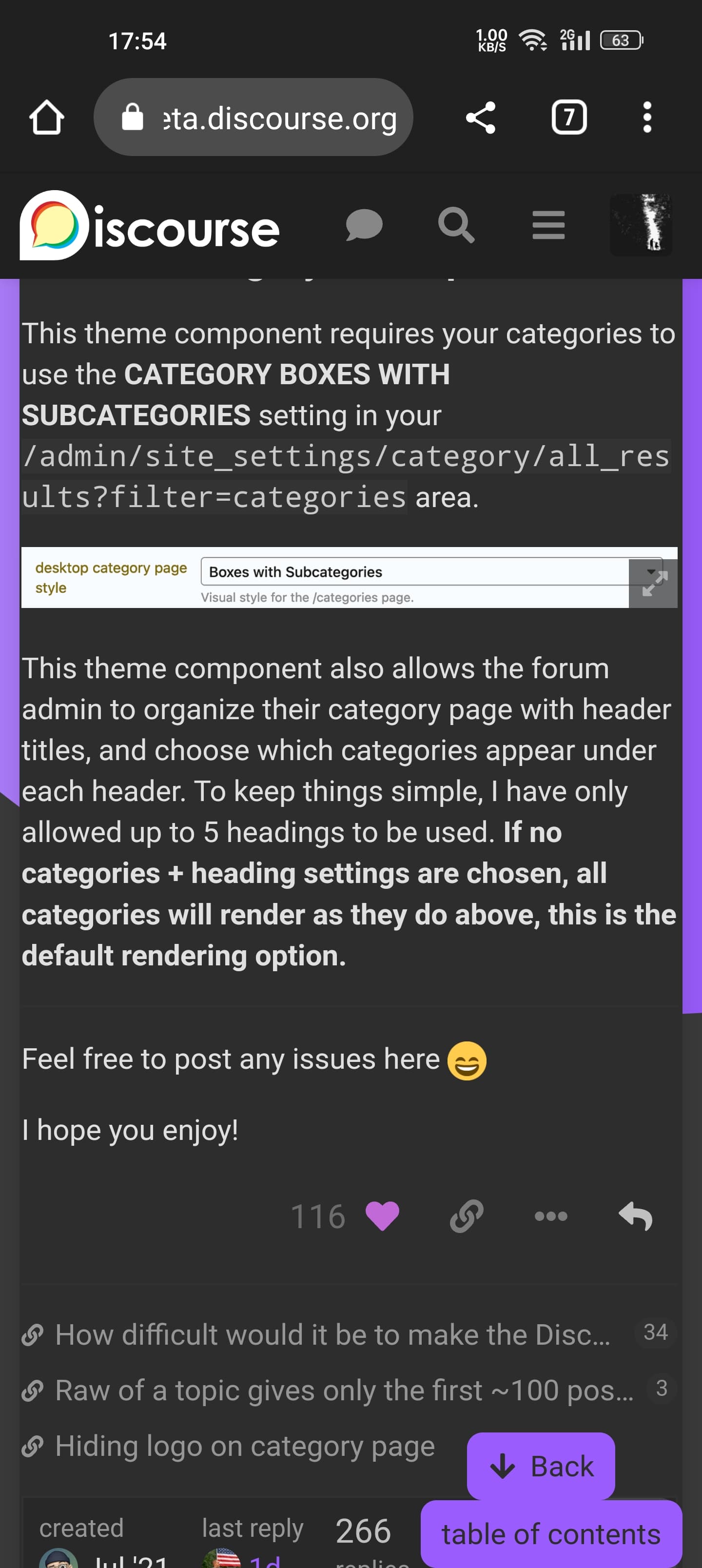
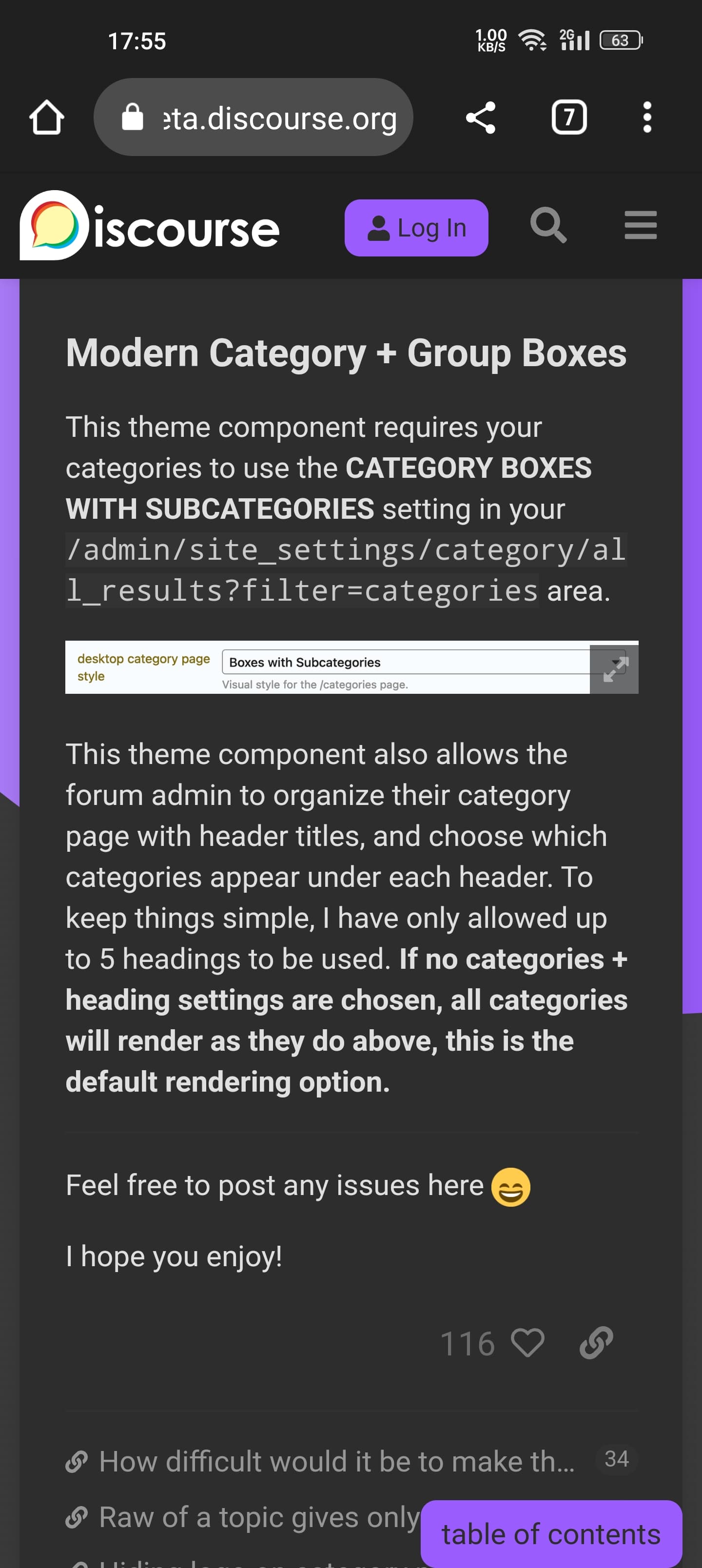
The only way to do this would be to disable the component that customized the category page. You will want to go to https://discourse.jordanvidrine.com/admin/customize/themes, click on Components and find Modern Category + Group Boxes. Once on that page, scroll to the bottom and click on Disable
Okay. But the theme can not to custom 
One more question, I need to show the number of views in the topic list, please tell me how to do that thank you very much
Hi Jordan, thank you for your response! I really appreciate it!
Hey @jordan.vidrine thanks for the great theme! I’m wondering if there’s a way to show categories and latest in the homepage? let us know.
My theme is discourse.fotografos.online - for the life of me WHY IS THE TOP white? Where is my header!??  someone help! It’s a fresh install! what do I do to add an image there instead of solid blue?
@jordan.vidrine Is it possible to add a Views column? If so, where can I access this option? Thanks.
Thank you for the reply and for sending this info. I only wish I knew how to apply this to the theme!
admin/customize/themes
Edit Html/css
Thank you. I really appreciate your help.
I have not gotten the HTML/CSS to work with the current theme. However, I can see the “Views” section when previewing the new component. The theme also shows the new component as added.
Here is a short video: https://share.cleanshot.com/ekutkT
Please let me know if you see something I am doing wrong with the setup when time allows.
Thanks for all your help.
You could go through the following and add the css there:
I am in no way a developer, or programmer. I spent a few hours playing around with the CSS code using the Inspect Element feature in Google Chrome. I was able to get the view column to display correctly, and also did some re-sizing of every column to my preferred liking. You are more than welcome to adjust the width in the CSS code below. I have also added comments in the code so you can easily tell which code is for which column. For each column, there are 2 areas (Header, and row). These widths need to match.
I hope this helps all of you: @daming @bksubhuti @eddy2
Use this updated CSS below instead of the code provided by @jordan.vidrine above.
Option A) Add the Views column for only Desktop (Recommended)
Option B) Add the Views column for both Desktop & Mobile.
Option C) Add the Views column for only Mobile.
On mobile the 3 columns (Replies, Views, Activity) takes up to much room and is squished. If you need this for mobile, I suggest removing one of the 3 columns. You can do so by adding Display: none to both areas (Header, Rows) in the CSS code below for the column you want to hide.
/* [Topic] */

    /* Topic Header */
    .full-width .contents .topic-list .topic-list-body .topic-list-item .topic-list-data.main-link {
        width: 66%;
    }

    /* Topic Row */
    .full-width .contents .topic-list .topic-list-header .topic-list-data.default {
        width: 66%;
    }

/* [Replies] */

    /* Replies Header */
    .full-width .contents .topic-list .topic-list-header .topic-list-data.posts {
        width: 7%;
        order: 2;
    }

    /* Replies Rows */
    .full-width .contents .topic-list .topic-list-body .topic-list-item .topic-list-data.posts {
        width: 7%;
        order: 2;
    }

/* [Views] */

    /* Views Header */
    .full-width .contents .topic-list .topic-list-header .topic-list-data.views {
        display: block;
        width: 7%;
        order: 3;
    }

    /* Views Rows */
    .full-width .contents .topic-list .topic-list-body .topic-list-item .topic-list-data.views {
        width: 7%;
        order: 3;
        display: flex;
        justify-content: center;
        align-items: center;
    }

/* [Activity] */

    /* Activity Header */
    .full-width .contents .topic-list .topic-list-header .topic-list-data.activity {
        display: block;
        width: 7%;
        order: 4;
    }

    /* Activity Rows */
    .full-width .contents .topic-list .topic-list-body .topic-list-item .topic-list-data.age {
        width: 7%;
        order: 4;
    }
@jordan.vidrine If you have any revisions to the CSS I wrote please let me know. I don’t fully know what I’m doing…but it works lol.
I absolutely love this theme, but noticed some little minor odd bits, so I also added the following CSS to make it look a little nicer in my perspective. I hope this helps someone else with the same preferences.
")
/* Add some padding to the Category, Sub-Category, Tags, searc, latest, new topic, and notification area*/
.list-controls {
    padding: 5px;
}

/* Adds some padding to the Topics area */
div#list-area {
    padding: 6px;
}

/* Aligns the Replies number more to the right */
.full-width .contents .topic-list .topic-list-body .topic-list-item .topic-list-data.posts {
    float: right;
}
")
/* Removes the blue background for category only */
html .category .background-container {
    background: #fff;
    clip-path: none;
}
")
On mobile, there is a Category dropdown. When clicked and either Latest, Unread, or Top is selected, you cant select Categories from the dropdown again.
")
")
")
")
At this point, a user is unable to select the dropdown and choose Categories again.
Any advise on how to fix this issue?
Thanks
Thanks a ton for posting these helpful instructions for those wanting the view column to be visible.
Do you have a link to you site? I am trying this on mine locally and am unable to reproduce.
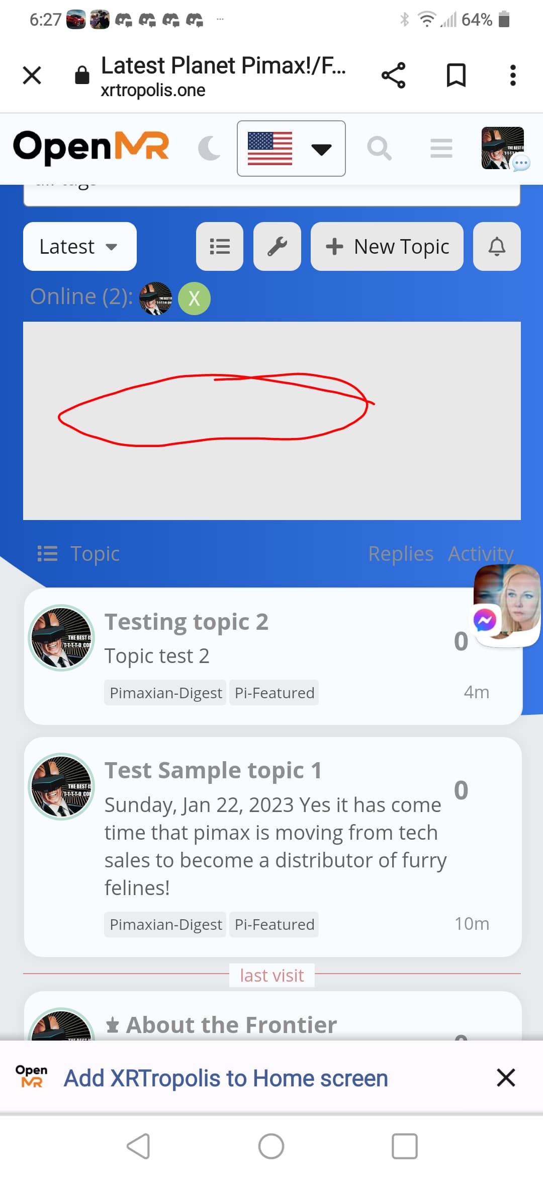
Thank for this complete polished full theme.
I am having an issue with featured topics component not showing the cards. I would like to also have the option to have it only show featured topics within specified categories. Which in theory it should or even in the variants based on the official one.
see pic below
I can if needed dm you a link to take a look. Both test topics have pics that are featured; though using custom tag pi-featured. Running test-passed
Please send a link, Ill take a look 
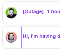
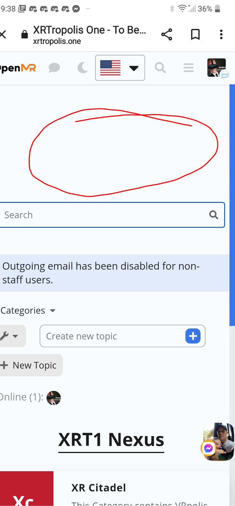
Just cross posting this here. Thought Chat plugin had a conflict issue with Discourse Search Banner. But after trying a preview of just the Banner. Ir seems to be an issue related to Air Theme background.
See in Link below.
https://meta.discourse.org/t/issue-with-discourse-search-banner/254231?u=heliosurge
Just wondering if you have had a chance to evaluate the Chat plugin issue? as described above? My apologies as imagine your quite busy. I thought it was a conflict with Search Banner but it seems to be the Air Theme background. The chat plugin seems to be creating a white central column that overlays over the blue background.
Hi,
Found an issue when Discourse chat plugin activated the Banner of Discourse Search Banner blanks.
Running Test-passed
using Air theme. When Chat plugin disabled it displays no issues. After chat enabled as above.
EDiT: Was mistaken. Re confirmed it is actually a conflict/issue with Air theme background see blue is cut out/off. See posts below with chat off Blue background is displayed properly with Discourse search banner overlayed properly in white on blue.
Hi Heliosurge, I’m not quite sure to understand the issue (I do see an empty area on your screenshot though)
Can you share the exact steps we need to do to experience the issue so we can reproduce it ourselves? 
It was very simple. The Air Theme had the Discourse Search Banner installed as part if the complete theme.
As stated running Test-Passed.
Once the Chat Plugin is enabled the Wrlcome banner if the Discourse Search Banner no longer displays the Welcome message.
Turn Chat plugin off. The Welcome banner is displayed.
Chat plugin Disabled
You can see in this ss the Chat plugin icon is gone from the header. You can also see tge other effects that the chat plugin is sermingly doing to the background creating a white empty rectangle ignoring the blue background.
Now looking at it might it be interfering with Air Thene’s blue wallpaper? as text is white in the banner. So I might be on the wrong track with the Discourse Search banner. It might be a conflict with part of the Air theme… ??
Confirmed. my apologies it seems ti be a conflict with Air theme background. Jist tried a preview of just Discourse Search Banner with Chat plugin.
see below
Sorry for the incorrect duiagnosis… 
Taking a further look in the Air Theme the blue part of the background is blocked in that center column when scrolling the blue is just on the outer edges. When chat disabled the blue part of the background connects from left to right through the center.
vs
Just giving this a bump. It seems to be actually the Air Theme background having a central white column. see pics above.
Just wondering if the team has been able to reproduce as have isolated to the Air Theme background and not an issue with search banner.
Hello Dan,
It seems your Search Banner plugin outlet is on the default above-main-container? I think you need to change this to place the Search Banner out from the #main-outlet 
However the theme has a chat custom style when enabled on the #main-outlet which I think only need to be active on chat pages.
This is adding the background with !important to the #main-outlet which override the theme background transparency on #main-outlet etc…
")
I think this is would be better with restrict this to .has-full-page-chat so only appears on chat pages?
With above-main-container setting
With below-site-header setting
I’m adding “category logo” Images to some, but not all, of my categories.
expected behavior: When I add a logo image to a category, the size of the label remains the same as those of other categories.
observed behavior: When I add a logo image to a category, the square is comparatively larger than the squares in the labels of categories without logo images. Beyond not lining up with categories in the same column, rows with categories with logo images are taller than rows with categories without logo images.
This happens on mobile and desktop
How can I fix this?
")
")
")
")
")
")
")
")
")
")
")
")
")
")
")
")
")